The deformed work is the end, not the means to the end. The Deformed Humanities is all around us. I’m only giving it a name. Mashups, remixes, fan fiction, they are all made by breaking things, with little regard for preserving the original whole.
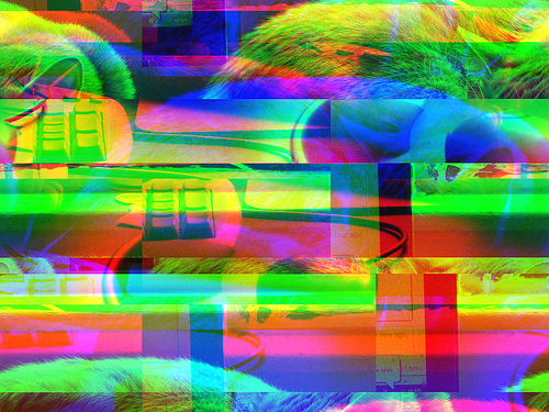
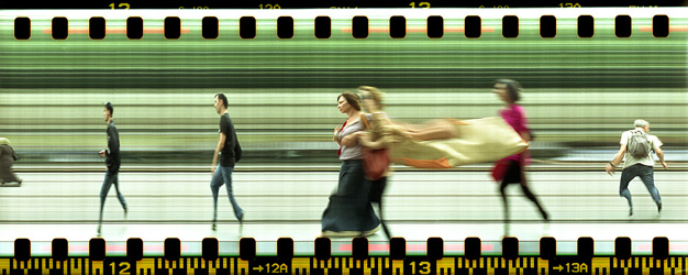
Inspired by slit-scan photography, I wanted to recreate this technique but incorporate a level of interaction. By dragging across the trackpad, I imagined a similar “stretchy” effect being created with an image. The finished sketch is embedded below:
Press r to reload a new image, h and v to switch between horizontal and vertical slices. Link to code
As the cursor moves across the image, slices of the image are copied and then “pasted” back on top. Pressing “h” or “v” toggles between the horizontal slices and vertical slices respectively.
I also developed an iteration that uses the mouseDragged function to add slices.
Although neither technique quite captures the same continuous effect that’s achieved in slit scan photography, the distorted / noise effect is interesting!
Don Norman, Emotion and Design: Attractive Things Work Better
Much of Norman’s writing discusses techniques for designing tools* (things) to be understood, effective and usable. Through an explanation of affordances and signifiers, he advocates that tools should indicate what actions are possible and where and how these actions should be done.
*I’ve chosen to use the word “tool” rather than “thing”. In the context of Norman’s arguments, the things are used and are not solely aesthetic creations (although they can also be aesthetically pleasing!)
Fundamentally the tools we use shape the output we produce. The resulting product—whether explicitly or not—has traces of the process by which it was created. Physical objects can have physical evidence of their process, such as seeing the layers of filament from a 3D print. However, a digital process may be less visually apparent in its final product. Where was the mouse clicked? Was the cursor movement controlled by a single finger on a trackpad, multiple fingers, a mouse, a joystick?
In his book “Software Takes Command”, Lev Manovich writes about how artistic software such as Photoshop, Final Cut, and Illustrator have shaped the visual aesthetic of current media and design. He explores how these visual language “tools” within a software platform often recreate the effect achieved by physical tools, such as brushes in Photoshop, and debates what this means to the “medium”.
Interestingly, there is an abundance of tool recommendations on the Internet. The Setup is an interview blog in which people purely talk about the tools they use to complete their work. Yet the answers are brand-based, not generic descriptions. One interviewee states she uses Google Drive rather than describing a cloud-based file storage platform as part of her workflow. In naming brands rather than devices, we are not discussing how a tool achieves a particular outcome but rather associating our identity with the identity of a company. I would be interesting in reading someone’s tool recommendations described through its affordances and signifiers. (Future blog post!) By taking the recommendation of someone else, are we uncritically removing ourselves from part of the design process? Should conceptualizing an idea be consciously coupled with the selection of tools, the means by which an idea is manifested?
When we make things—physically or digitally—it is important to be critical of the tools we are using to do so. Do we need to make new tools to accomplish our goals? Are we (adversely or positively) modifying a design in order to be achieved a tool’s capability? What exploratory opportunities are enabled by a tool? Being cognizant of the degree to which tools inhibit or prescribe an outcome is fundamental to a critical tool selection process. Bethany Nowviskie, Research Associate Professor of Digital Humanities at the University of Virginia, reinterprets William Morris’ common refrain—“You can’t have art without resistance in the material”—to be understood as a resistance within a tool, or perhaps “process”.
Morris’s final, throwaway complaint is not about that positive, inherent resistance—the friction that makes art—which we happily seek within the humanities material we practice upon. It’s about resistance unhealthily and inaccessibly located in a toolset. 20th century pop psychology would see this as a disturbance in “flow.” 21st century interaction design seeks to avoid or repair such UX (or user experience) flaws…Evidence of friction in the means, rather than the materials, of digital humanities inquiry is everywhere evident in the program of this MLA convention.
While this resistance can be frustrating and unintentionally affect the product, it also provides opportunity to exploit the intended operation of tools. This remixing of how a tool operates can be eye-opening and engages a new form of knowledge. For example, it took Destin Sandlin eight months to learn how to ride a bicycle that steers in the opposite way as expected (left turns right and right turns left). *Sidenote: it only took his son a few weeks! Perhaps the thing to do is keep learning, using and manipulating new tools in an attempt to prevent them becoming so ingrained in the creative process.
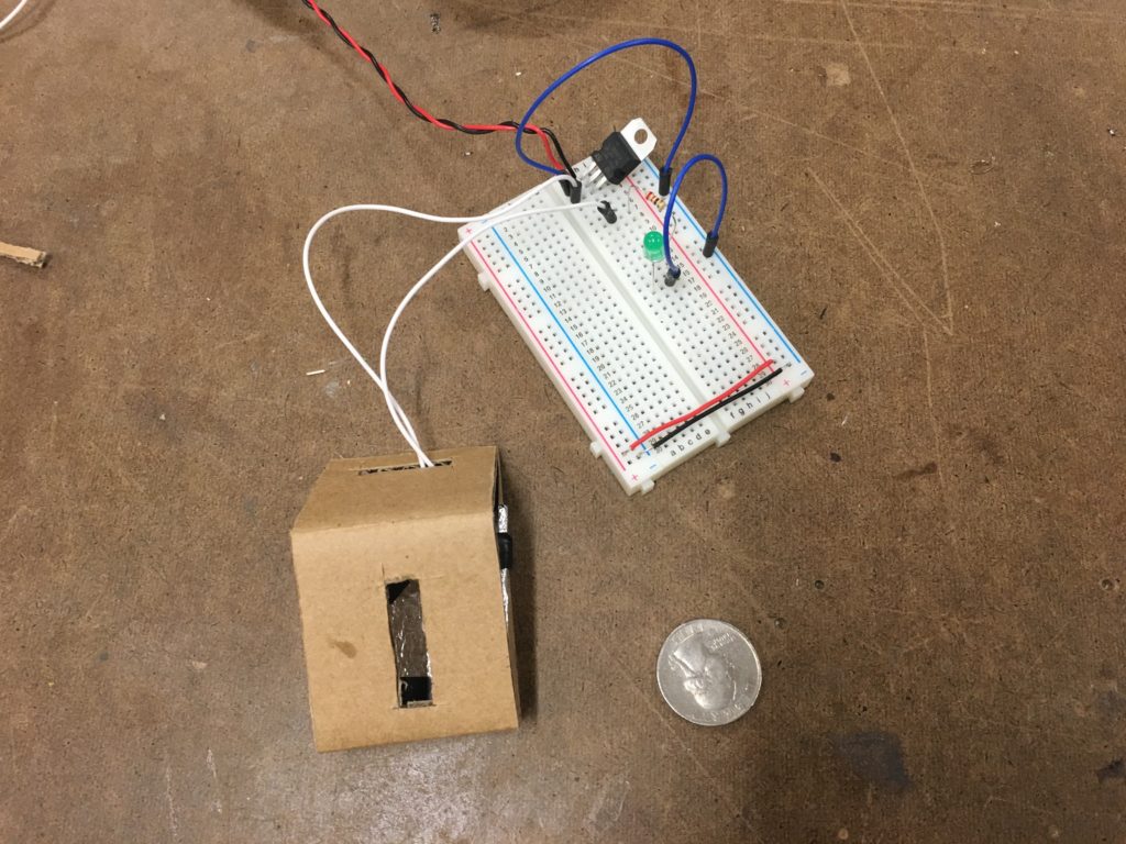
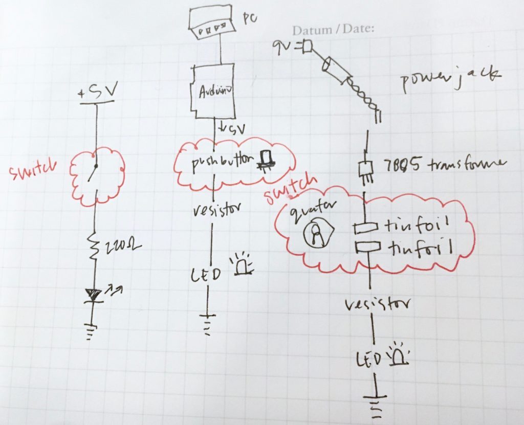
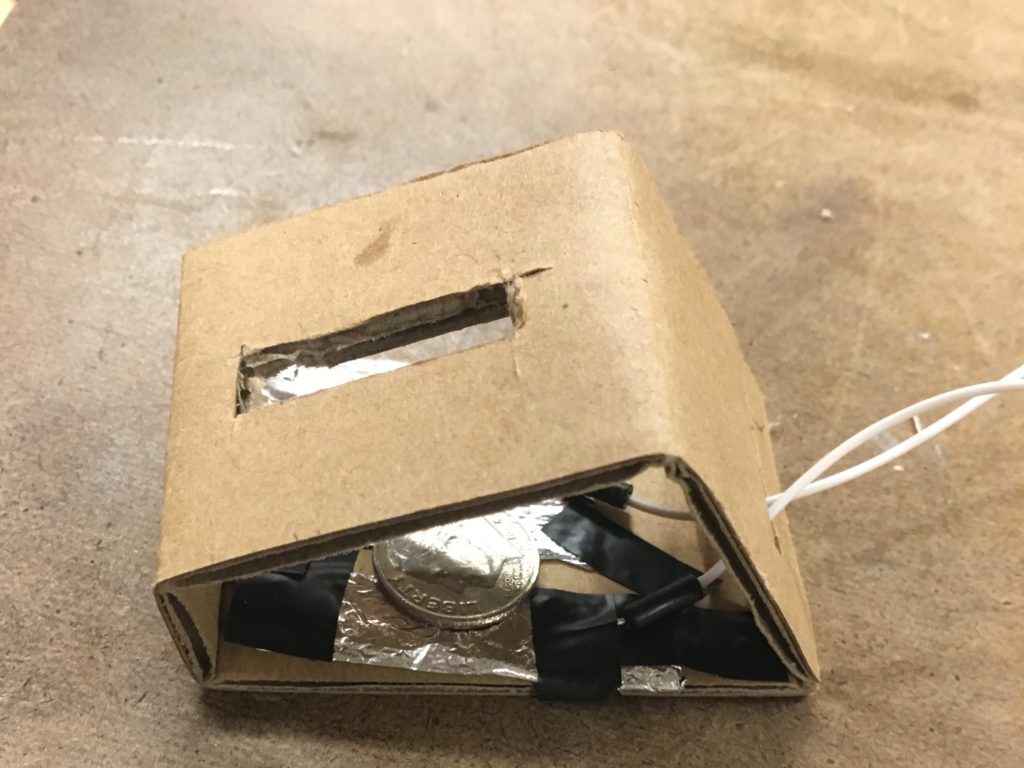
A switch can simply be considered as two pieces of conductive material being separated and then brought together. In order to make a homemade switch, I turned to my pocket: coins are conductive!
Using a quarter and tinfoil, I rigged up a light-up “piggybank”. When a coin is dropped through the slot, it bridges the gap between two separate pieces of tinfoil, thus closing the circuit and illuminating the LED.
Close-up showing separated tinfoil portions and overlapping quarter
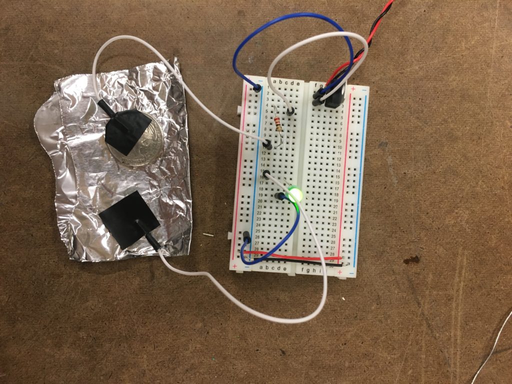
Before assembling the final enclosed “design”—what would Dieter Rams say!?—I tested the circuit by attaching one wire to a quarter and then another to a piece of tinfoil. When I lifted the quarter, the LED turned off and likewise, when I dropped the quarter on the tinfoil the LED illuminated. It was enough to prove that a quarter and some tinfoil would do the trick!
Early prototype with exposed quarter and tinfoil
Still, hiding the tinfoil beneath some cardboard feels a bit like putting lipstick on a pig!
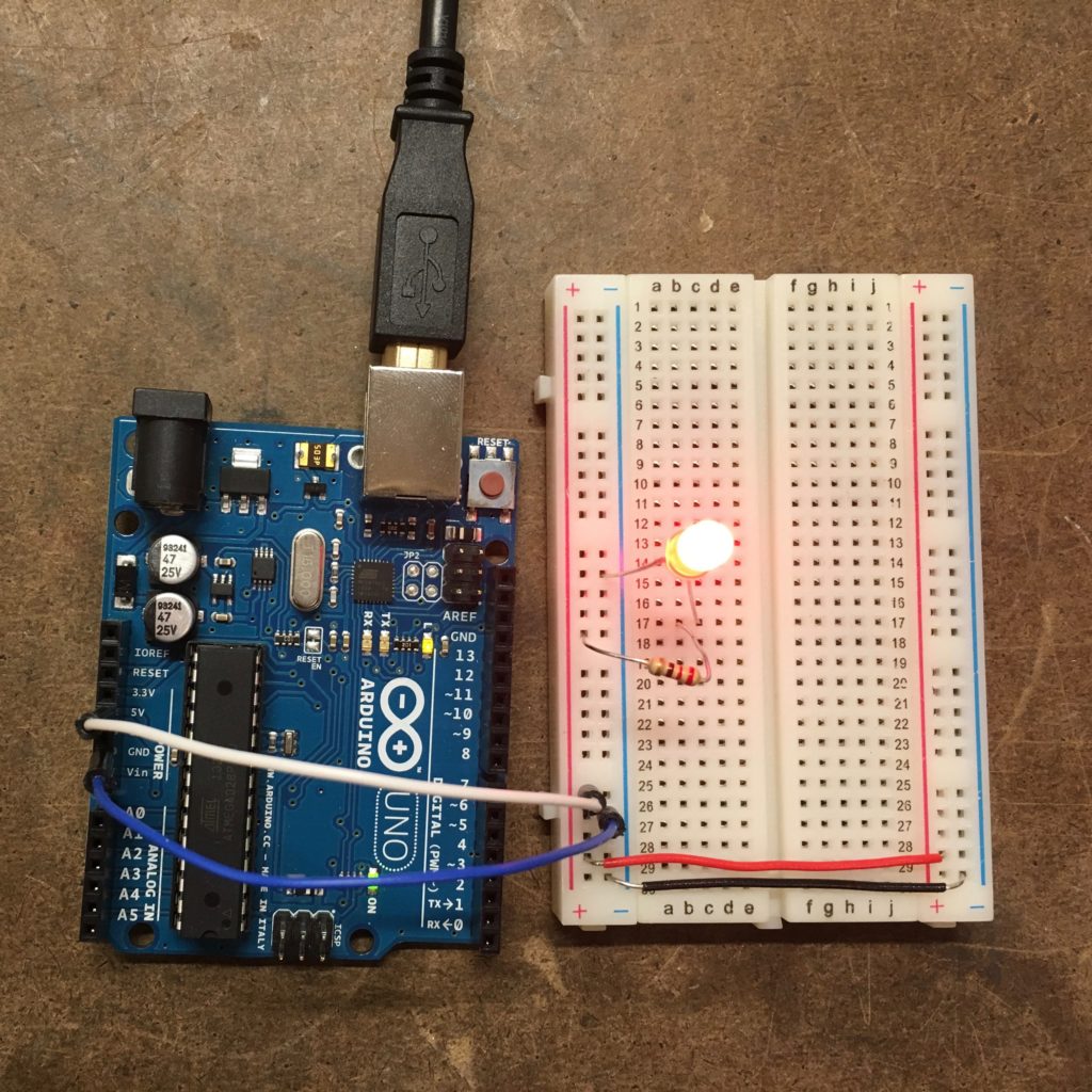
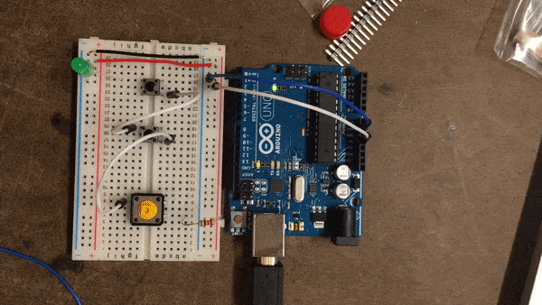
Having a single LED turn on was no problem: bring over power (5V) and ground from the Arduino, add a 220 Ω resistor, connect the LED to power and ground. Light!
Powering an LED
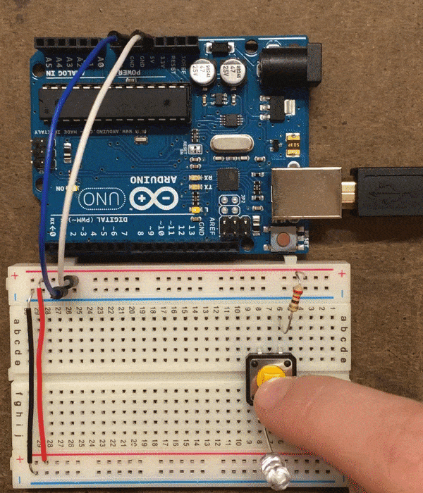
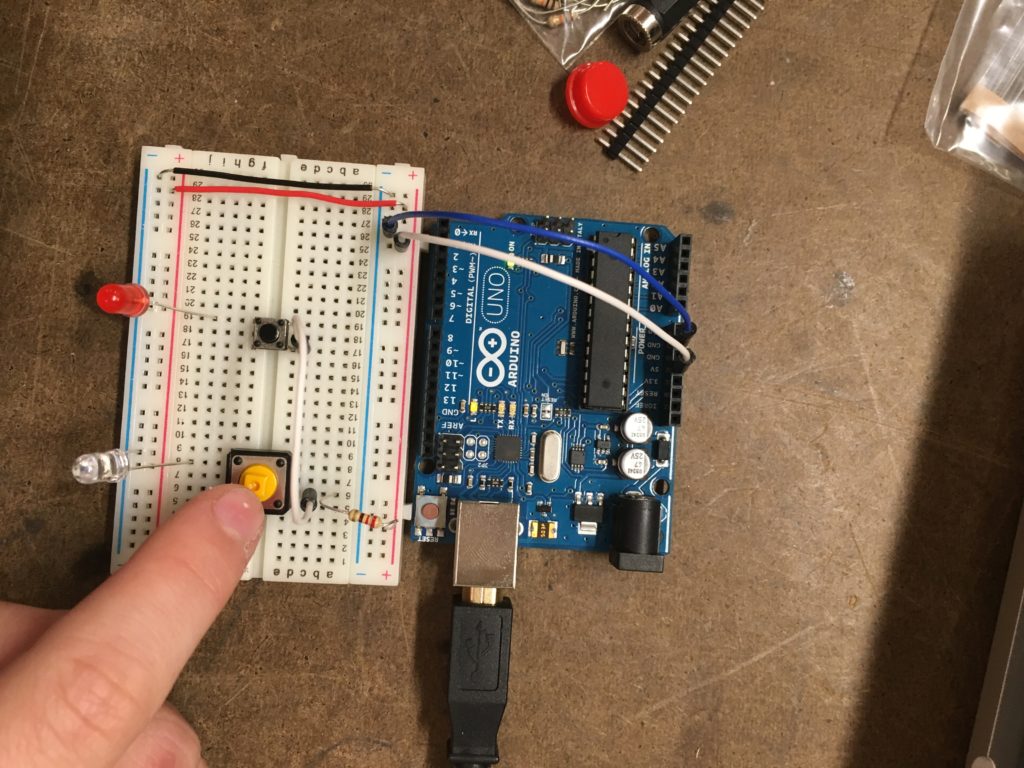
Adding a push button complicated the circuit. Initially I had wired in the circuit in such a way that the default state for the LED was on, and pushing the button turned it off. Originally I thought perhaps this was a property of the switch itself. Digging into the switch, I realized that I had placed the LED in the same row as where I had located the resistor. However, when I moved the LED to the other row of the switch, it worked as expected.
Simple push button
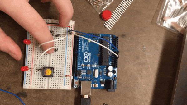
Wiring multiple switches in series and parallel was fairly straightforward once I understood how the electrons flowed through the push button. For demonstrating a series circuit, I wired the output of each switch to the input of the following switch.
Three switches in series
To complicate the series, I also added an LED at each switch, showing that the last LED (green) would only light up when the other red LEDs were also lit. Lesson learned: use a tripod when shooting video, one usable hand is not enough!
Switches in series with multiple LEDs
In parallel, I wired up an LED to each switch—whoops! I realized in hindsight that it was meant to be a single LED. However, the circuit still worked as expected. Had I just used one LED, I would have had to wire the output from each button to a new row that the LED was connected two—allowing either button to turn on the LED. Next time!