Subway Shimmy (039)

Subway Shimmy slowly follows the A Train along its length, from Far Rockaway and Ozone Park up to Washington Heights and Inwood.

The map is the final part of the “Slow Dance” series in which videos pan along seemingly identifiable “divides” in the landscape. Uniquely, “Subway Shimmy” highlights difference not only on either side, but also along its path when moving from one neighborhood to another.

The subject of the map is not always evident as the subway line runs both above and below ground. It divides ocean front housing and Jamaica Bay, but is unseen beneath the indifferent skyscrapers of Mid-town. When it is below ground, does it follow the street grid or bisect city blocks? When above ground, does it connect or divide neighborhoods?

Technical

As with the previous maps in the series, the path was smoothed in Rhino and then regular points along it were exported from QGIS as a GEOJSON file. When loading the website, the map starts at a random point rather than privilege a particular geography. On reaching either end, it continues panning in the reverse direction.
Compare To

Frankenstein (038)

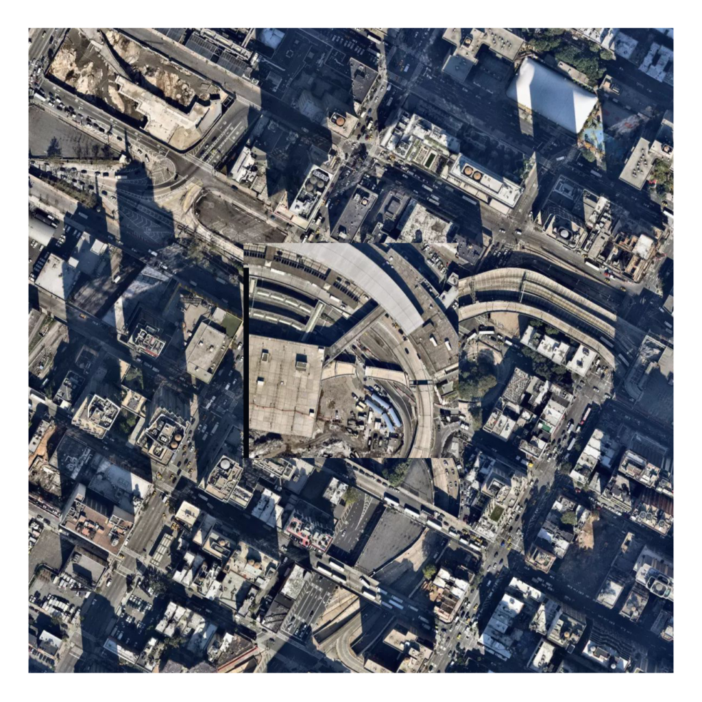
Frankenstein is a diptych of an aerial image and that same image re-made from visually similar tiles. Comparing original and re-made, the map examines how the identification of similarity is both defined by, and extends beyond, an extent.

The map is the last in a series of three that explore visual similarity as detected by a machine learning model. The first map exchanged the center tile with similar tiles. The second flipped between center and context to travel from place to place. Finally, “Frankenstein” exchanges all the tiles. As such, it is not a simple comparison with context, but a whole new context, asking, what can be determined as ‘similar’ without context? When all tiles are similar to, but different from the original, is the replaced image the historical context?

In the original, tiles form a continuous landscape. Yet, as the re-made image is derived from similarity within each tile — not the relationship between tiles — these new adjacencies rarely align to form new continuities. The replacements are similar to their originals in different ways.

Depending on scale and extent, the edges of the replacements dominate or recede. When more tiles are used, discontinuity has less emphasis. However, at the smaller extents, the edges form starker boundaries.

As a diptych, the similarity of the re-made image to the original is always in comparison. In one instance, where the original is composed of green-space and housing, the proportion of each is recreated with every cycle.

In another instance, where parkland dominates the entire original frame, the reconstructed image highlights how different “similar” green spaces can be.

Next Steps

Figure out how to do the process at a much larger scale (25×25 tiles)

Compare to
  • Pan Pan Pan (and the relationship between tiles)
  • Back and Forth (and the meaning of context)

Fore-blob, Middle-blob, Back-blob (037)

Fore-blob, Middle-blob, Back-blob reinterprets the traditional figure-ground relationship by treating vegetation as the “figure”. From a near-infrared aerial image, vegetation is identified from red hues and isolated with a crude blob-detection algorithm.

The map attempted to algorithmically dissect the landscape, similar to the manual technique of Foreground Middleground Background (032). However, the hue range wasn’t sufficiently limited and the resulting map is imprecise. Consequently, red roofs clutter the image, pixel evaluation lacks correspondence to a semantic understanding of shapes, blobs make the building edges formless, and holes exist where vegetation is known to exist. While unsuccessful, some patterns are still evident, such as the regularity of sidewalks and the distinction between detached houses and apartment buildings.

The map is pannable, allowing users to explore the area of Prospect Park South. When the mouse is pressed, the aerial image is revealed in full to allow a comparison between the figure and ground.

Next Steps
  • Test other blob detection algorithms.
  • Revert back to the algorithm first used.
  • Determine the hue range needed to exclude red roofs.
  • What pixel values or algorithms can be used to identify building footprints?
  • Place the figure-blobs in contrast to the ground.

Back and Forth (036)

Back and Forth is a map that advances through aerial images linked by the visual similarity of the center tiles, asking: do similar places have similar contexts?

Like A Different Similar Center (030), this map creates an imagined geography by replacing the center with a similar, but geographically disparate tile. However, it then replaces the context with that of the new center. As such, it moves from place to imagined place to “similar” place.

By alternating between center and surrounding, it compares the similarity of the settings that frame them. It creates a chain of similarity, and in doing so, undermines the supposed similarity of the center — a beach becomes an airport, becomes a sports field, becomes a water treatment plant. Yet, these identifications are only known by seeing the center in its original context. In moving from place to place rather than comparing to a single context, the map asks: are these places similar?

Technicals

The process for collecting data from Terrapattern—a project for identifying visual similarity in aerial imagery—is detailed in a previous blog post.

Next Steps
  • See how the map is different by reducing the extent of the center tile to match that used by Terrapattern

Routine Difference (035)

Routine Difference is a video describing change in Times Square over the course of eight hours on Monday, February 5th.

Consecutive frames from the video feed were differenced and animated to represent the change throughout the day. Differencing removes stationary elements, like architecture, while people, billboards, and shadows, are featured prominently. As each frame replaces the previous, a faint grid of past differences lingers to create a transitional in-between space.

When people linger, their figure is reduced to only their small movements. Similarly, as the day progresses, the movement of different figures blurs together into an ambiguous mass.

Technicals

The project cycles through 1,000 images from the Times Square camera feed. Frames were captured every 300 seconds using a simple appleScript.

Pixels of each frame are evaluated against the preceding frame. If the cumulative difference of red, green, and blue channels is greater than a threshold, the corresponding pixel from the frame is added to an empty array. If the difference is less than the threshold, a placeholder value is added instead.

To eliminate noise and negligible areas, a process similar to edge detection is executed on the array. First, the array is divided into sub-arrays. Within each sub-array, the number of placeholder values is counted. If placeholder values are found, part of the sub-array is replaced with white pixels, while the remaining cells act as a “ghost” of the original frame. If placeholder values aren’t found, pixels from the originating frame are used.

The video uses 1,000 frames, so a small python script was created to read the folder directory and generate JSON objects for each frame so that they could easily be loaded in javascript.

Next Steps
  • Find a more efficient method to call the frames.
  • Explore different frame rates for the video.
  • Compare the transitional in-between spaces of the “ghosted grid” to A Different Similar Center (030) and Flat Incline (027).