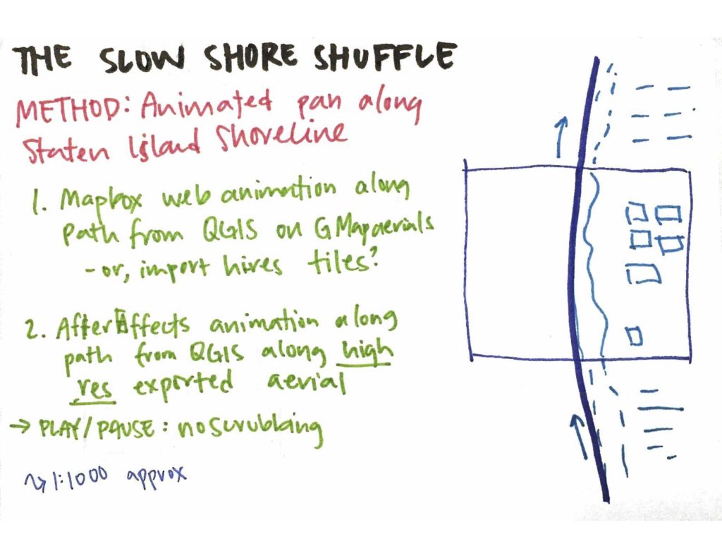
Slow Shore Shuffle (001)

Slow Shore Shuffle” follows the shoreline of Staten Island. Movement is unhurried and interaction is deliberately constrained — one can’t pause, resume, pan, or zoom. The island is never shown in its entirety, and once out of frame, the same place isn’t seen again until the video loops back around.

Mapbox GL API is used to load aerial imagery from Digital Globe. The animation and changing orientation is achieved with the panTo() method which animates the map to a given coordinate. A smoothed bearing orientation is calculated by averaging the angle between three consecutive coordinates-pairs.

QGIS was used to generate the coordinates. The shoreline SHP file is available from NYC Open Data, however, the borough boundary was more useful, as it didn’t include inland streams. The Cartographic Line Generalization plugin was used to further smooth and simplify polygon geometry. Data was transformed from New York Long Island (EPSG:2263) projection to WGS 84 (EPSG:4326), which is used in Mapbox. Points were then generated at a regular interval along the length and exported to a CSV using the MMQGIS plugin. Lastly, the CSV file was converted to JSON for easy iteration, value-fetching, and loading into javascript.

Note: Colin Reilly has a nice blog post speculating on the choice of using the New York Long Island projection for NYC spatial data.

Next Steps:

  • Remove “knots” in the original shapefile to prevent the circling-rotation
Weekend Summary: January 6-7

This weekend focused on diagramming and annotating each controller imagined for Pong thus far. In writing each one out on an index card, additional questions emerged to support the principle thesis question:

  • What does it mean for the same controller to be used at a different scale of the body?
  • What body does each controller expect? How is this apparent? How can the controller be used differently?

Drawing from Susan Leigh Star’s article, “Power, Technology and the Phenomenology of Conventions”, considering other controllers for the same game asks: How could it have been otherwise? Why are games played with the same controller? Can we play the same game with different controllers?

Using the same controller assumes a leveled playing field — but only for bodies matching the “standard body” for which the controller was designed. Even then, all bodies are different and the body imagined by a technology is always that, imagined. Furthermore, bodies change — throughout a day, over the course of a week, over years.

This led to thinking about technology in sport: clothing such as full body high-performance swim suits in swimming, equipment such as clap skates in speed skating, strategic analysis as demonstrated in “Moneyball”, and modifications to one’s body with performance enhancing drugs. These too are all extensions of the body, yet some are accepted — clap skates — while others are prohibited — the swim suit. While clap skates initially caused uproar, they have now become the dominate technology in the sport. On the other hand, is a full body swim suit all that different than shaving one’s body? Is the judgement of performance within the sport then an evaluation of one’s skin? (Note: leading up to the Athens Olympics in 2004, The Economist published an interesting article debating performance enhancing drugs and whether their prohibition should be reconsidered. Similarly, a new book Rayvon Fouché called “Game Changer” questions the distinction between technical innovation and cheating in sport.)

Next weekend will revive a unfinished historical study of sensors to explore their genesis and how these technologies have shaped bodies over time. How have these sensors and their relationship to our bodies changed? How have they come to shape social relations? Further work will develop relationships between the various imagined controllers through the following classification:

  • Controllers using the same sensor, same action but produce a different outcome;
  • Controllers using different sensors but the same action to produce the same outcome; and
  • Controllers using the same sensor but different action to produce the same outcome.

One Minute Thesis Statement

Marshall McLuhan asserted that technology is an extension of the body – clothing extends our skin, a white cane extends our touch, subways extend our movement. To revise McLuhan, technology extends a universalized body which, in turn, identifies particular human bodies by their correspondence to this universalization. It is a body of a imagined form, imagined ability, imagined dexterity. Yet it’s just that – imagined. And our imagining of bodies is divorced from their actual material forms.

My thesis will reconsider the game of Pong to explore how technology universalizes bodies. In turn, I will ask:

  • How does technology shape bodies and likewise, how do bodies shape technology?
  • How do we understand our body through technology?
  • And how can technology extend the particularity of many bodies?

Making ‘Making Legible’ Legible: Part 5

Building on my previous work analyzing a large corpus of text, I continued to explore how the connections across various documents could be presented. My prior work on the project focused on constructing the database to allow for as much cross-analysis as I could (at that time) imagine and building out route in express.js and node for accessing the data. With the eventual goal of uncovering a geneaology across the texts, I’ve been looking at both document-level comparisons and sentence-level comparisons.

The focus of this iteration centered on how does the user move across these scales and what information is relevant at these scales?

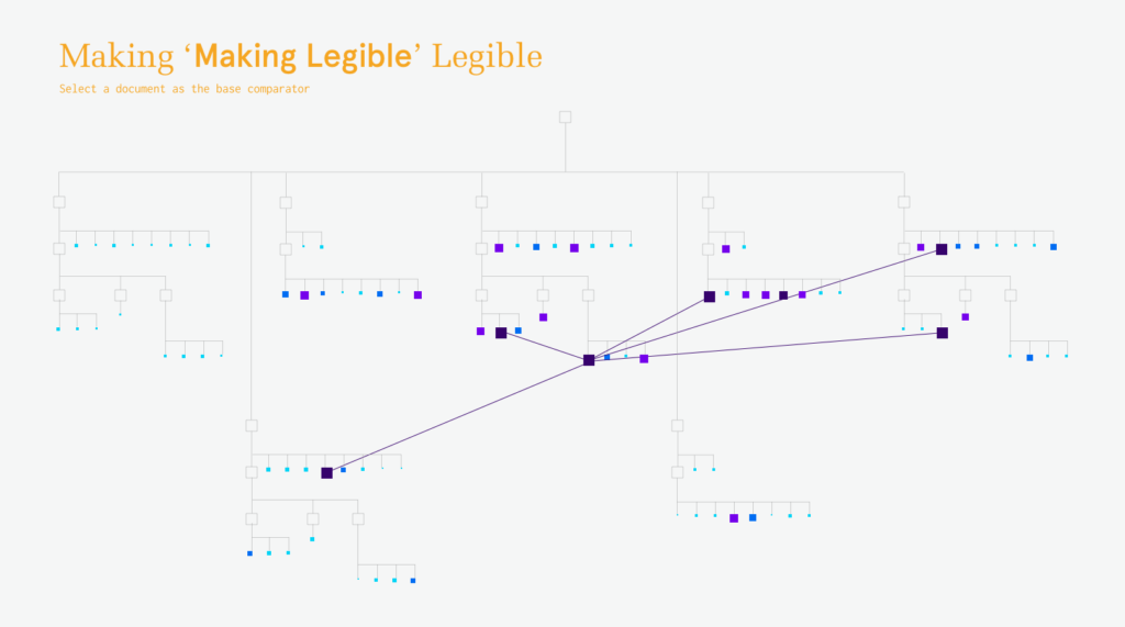
The initial landing page is imagined to be a geneology of documents. Currently, this is shown with simply the established folder-document hierarchies, but I intend to evolve this into a content-based “family tree”. This would also incorporate the aspect of time on the Y axis. (The author often brought in material between documents rather than working out of a single document chain.)
When hovering on a document, the similarity to other documents would be shown by size and color. This offers additional information for identifying which document(s) to further investigate.
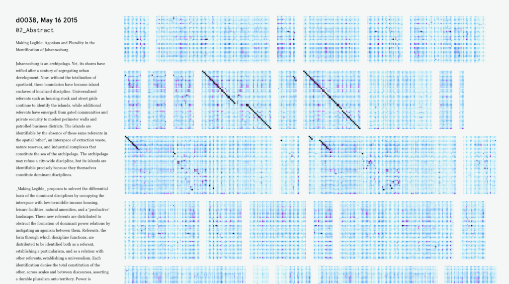
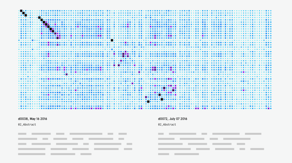
Clicking on a document from the geneaology then compares that document to all other documents at the sentence level. Each compared document is represented by a pixel-array in which each sentence in the document-pair is compared using the dice co-efficient method. This similarity value is again mapped via size and color. When dominant diagonals are evident, it indicates a high level of similarity within a portion of two documents. The jump between the geneaological view to the comparison view seems very disconnected and something that still needs a lot of work.

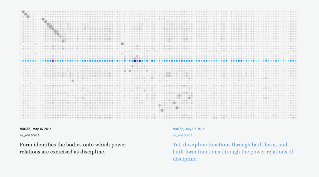
From the array of arrays, a document-pair comparison can be isolated and the user can now finally read the constituent sentences when hovering. This raises the question of what use is the investigation if the readable sentences are buried so deep in the interaction/piece? On one hand, with 680 documents, it’s imposible to get a sense of the ‘whole picture’ without some form of abstraction. But how can the abstraction still be relevant? For me, within this project, the abstraction is about constructing and revealing relationships across the corpus — in a (not-yet-realized) attempt to get beyond the established document and sentence boundaries.

The above visuals are my ambition for the project while the video below shows its current (rudimentary) coded form.