Light In The Apartment (010)

“Light In The Apartment” (live link) represents light meter readings taken every 96 minutes between sunrise and sunset on January 19th, 2018. Measurements were taken from a 16-point grid within each room of an apartment, resulting in a different density of readings in each space.

Current representation locates the points as they were distributed in space. As such, smaller rooms appear brighter because the circles describing each reading overlap at peak periods. As a counterpoint, there will be a second representation where points will be uniformly spaced.

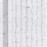
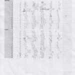
Points were marked out within the apartment using tape, and measured room by room in the same order each time.

The iPhone app ‘Light Meter’ was used to take the readings, and as such, measurements are acknowledged as being imprecise. Anything directly above the sensor, including clothing hanging on a door or kitchen cabinets, significantly impacted readings. However, the exercise became more about the representation of data collection than measurement accuracy.

Compare to:

  • Identifying Darkness (003)
  • Cardinal Direction (forthcoming)
  • Centerpoints v. Boundaries (forthcoming)
New York I Love You (009)

“New York I Love You” (live link) presents field recordings of the LCD Soundsystem song, “New York I Love You, But You’re Bringing Me Down”, played aloud in different contexts: on a subway platform, walking down Franklin Avenue, and at home. In playing the same song in different places, what of the original is heard above the noise of the city? Do the disruptions draw attention to the sounds of familiar spaces?

In each instance, the song was played at full volume from an iPhone 6S and recorded with a H4n Zoom recorder. The website is built using wavesurfer.js — a library for the easy and configurable display of waveforms. On hover, the moused-over audio clip is played and the others are muted. During play, the recordings are synchronous.

Next steps:
– Continue to capture the song played aloud in different places.
– Add labels for place and time of each recording.

Field Data Collection (001): Prospect Park Walk

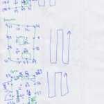
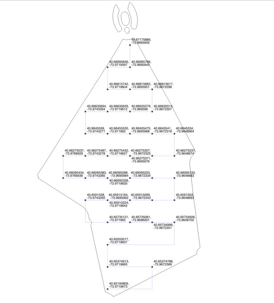
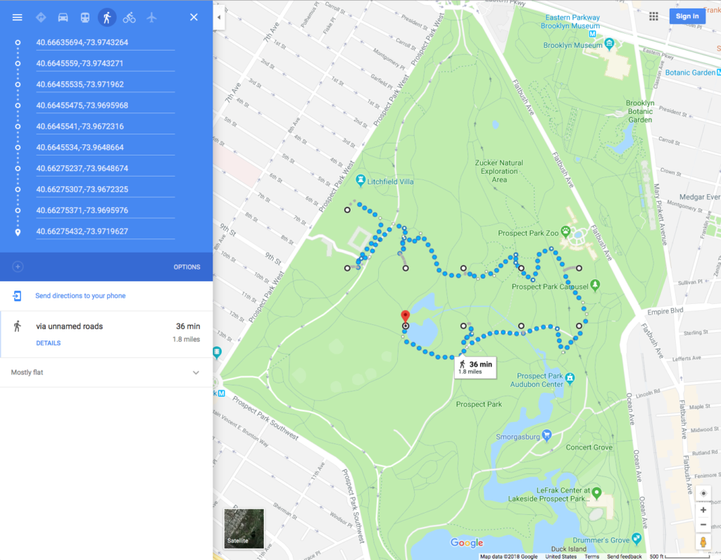
We overlaid a 200 meter grid on Prospect Park, ignoring features and topographic variation. Each point was identified by its latitude and longitude and an idealized snaking path that connected them. Our intention was walk to each point, collect data along the way, and capture additional data at each point.

Prior to starting the walk, directions were generated using Google Maps between sets of 8 points to get a sense of time and distance. Google Maps was used as it has more specific path data than alternative platforms such as Apple Maps.

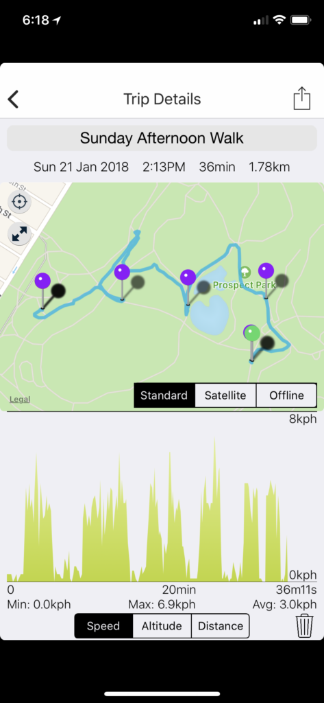
Once walking, these directions were abandoned in favor of entering each coordinate pair individually, point-by point. Occasionally, this method suffered from human error — entering the wrong point — evident by a deviation in the recorded path.

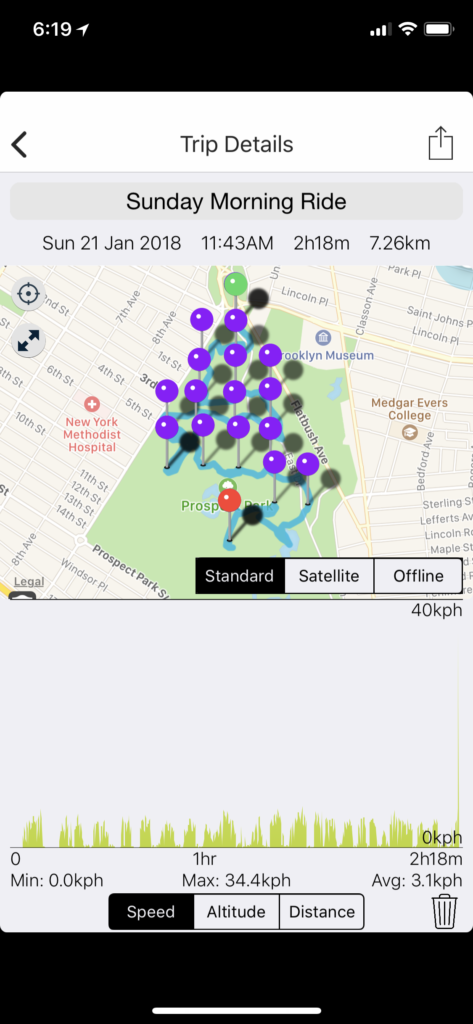
While walking, GPS position, accuracy, and altitude were captured using a Bad Elf GPS Logger. The track was automatically recorded at 12 second intervals, and when an intended grid point was reached, the position was marked as a point-of-interest. Additionally, three photos were taken of the GPS logger and two screenshots of its corresponding phone app to provide back up data. A photo of the sky, while facing north, was also taken at each point, to describe the conditions affecting the accuracy of the GPS positioning.

The impression was that data collection would be straightforward–we had coordinates on a grid and directions to each point. Using Apple and Google Maps, we assumed that if we entered exact coordinates, we would be routed to exact coordinates. As it turned out, mapping services are based on approximations. You don’t arrive at your destination so much as you arrive in its general proximity, with the presumption that you’ll be able to find your way from there. This illustrates the scale in which these services operate — three to five meters — and a remnant of human cognition left in the navigation process. These services foster an illusion of getting you where you need to go, but they only take you part of the way, and only on paths known to the services.

Subway at Grade (008)

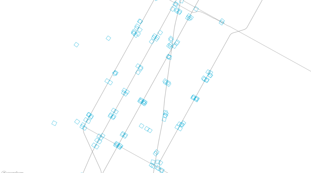
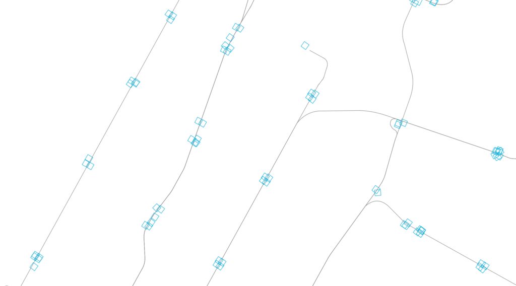
“Subway at Grade” (live link) plots all subway entrances within New York City. Departing from a previous exploration — From City Island (006) — the map explores transit density and sparseness at the scale of the subway entrance. Why do some stations have many entrances and some only a few? How far are the entrances from the subway platforms? Were entrances always inside of buildings or did the buildings build over entrances?

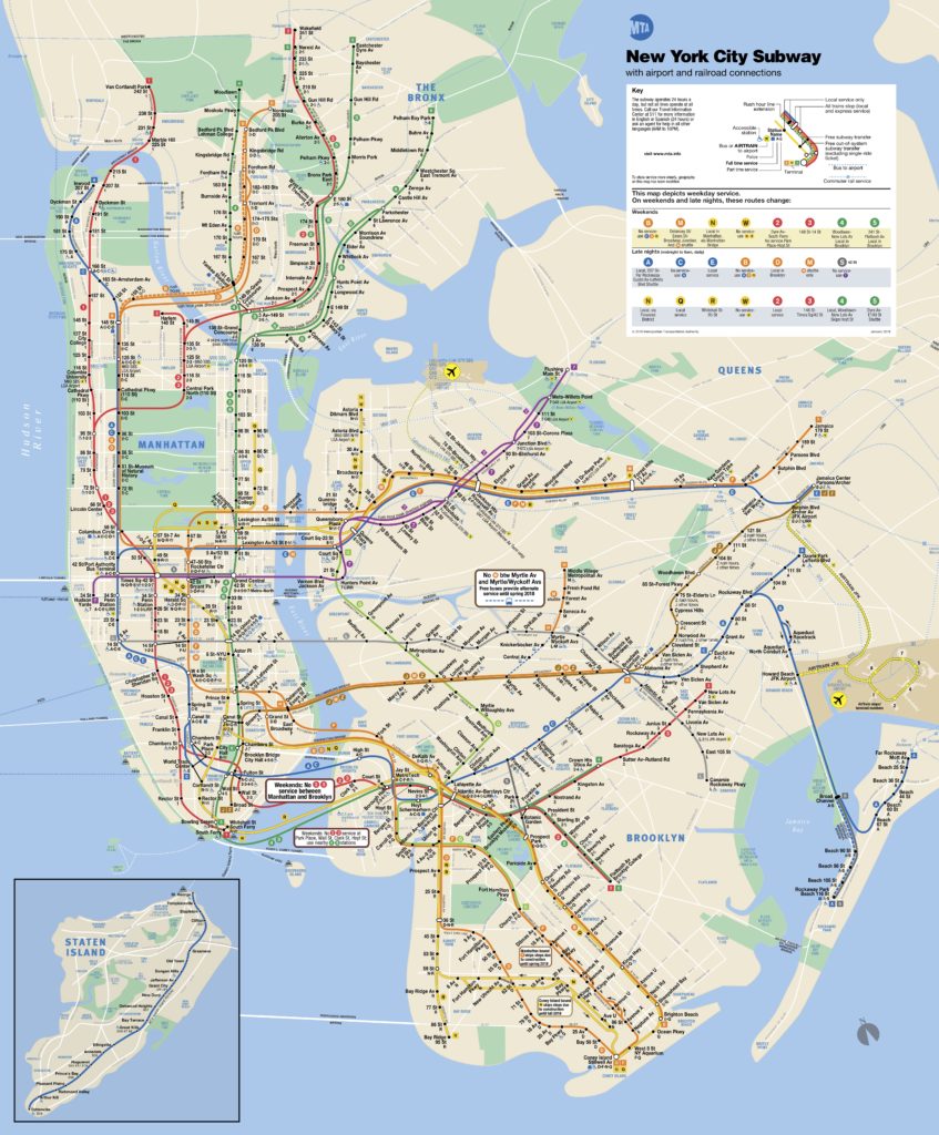
By emphasizing scale over clarity, as in the standard MTA subway map, the irregularity and idiosyncracies of the system become more evident.

When an entrance is clicked, the map zooms to the location and shows the corresponding aerial. After a few seconds, the map zooms back out and the aerial fades.

The map is displayed with Mapbox GL, and Turf.js was used to manipulate data. The footprints of the subway entrances themselves are very small, so an offset around each was created. First, a radial buffer was determined around each centerpoint, around which a bounding box generated a square extent. The square was rotated to match the orientation of the entrance. The angle of rotation was calculated using Math.atan() on the slope of one edge. Rather than dynamically create these offsets on the client-side, they were saved as a GEOJSON feature collection and loaded with the other GIS data.

The aerial mask was achieved by differencing the clicked station object with the overall map extent, and overlaying a solid white fill.

Next steps:

  • Add outline of subway station footprint below grade, if such data exists
  • Adjust colors of subway entrances to correspond to their line
  • Add labels for each station on click
  • Show nearby aerials also when zooming to particular stations
  • Add a mode to show aerials above each entrance in a grid, grouped by station. This removes the geographic space between them to give new adjacency and meaning.
  • Options to try:
    • On click, zoom in to a slightly larger image (but more cropped than currently), which reorients to ortho and shows other images of the entrances at the station (in a row) and the other stations (stacked rows) – maybe it slowly auto scrolls? Four or five rows visible?
    • Only show route lines on click (connect the stops on the particular line
    • Sidebar with grid of images for each subway stop on line (one row per station)
    • Export images of each subway station from QGIS? Or, can it be done by grabbing the images clientside from the canvas? (probably not good from a perf. standpoint)

Finding Green (007)

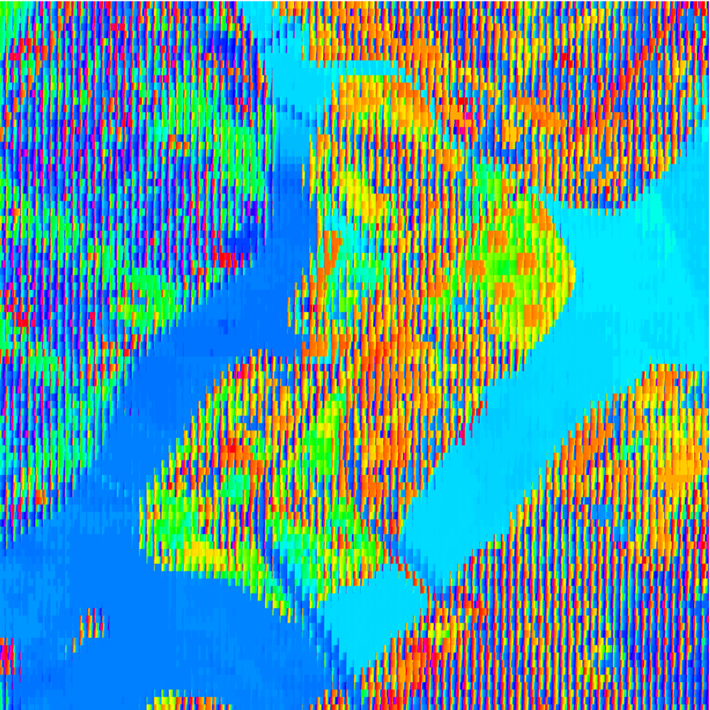
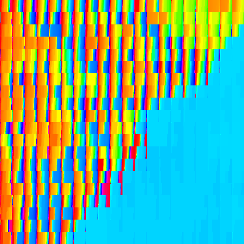
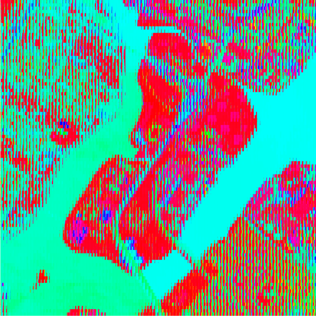
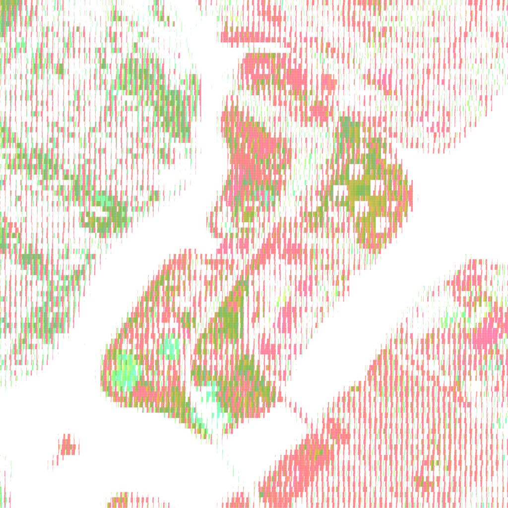
“Finding Green” (live link) divides an aerial image into subdivisions and sorts the pixels within each by their hue value. The sorting makes evident the dominant hue in each image, which are further exaggerated, and conflated, by saturation and lightness.

At its full extent, prominent hues are immediately recognizable; however, on closer inspection, the variety within subdivisions becomes more clear. What do these hues represent? Is “green” an adequate proxy for parkland?

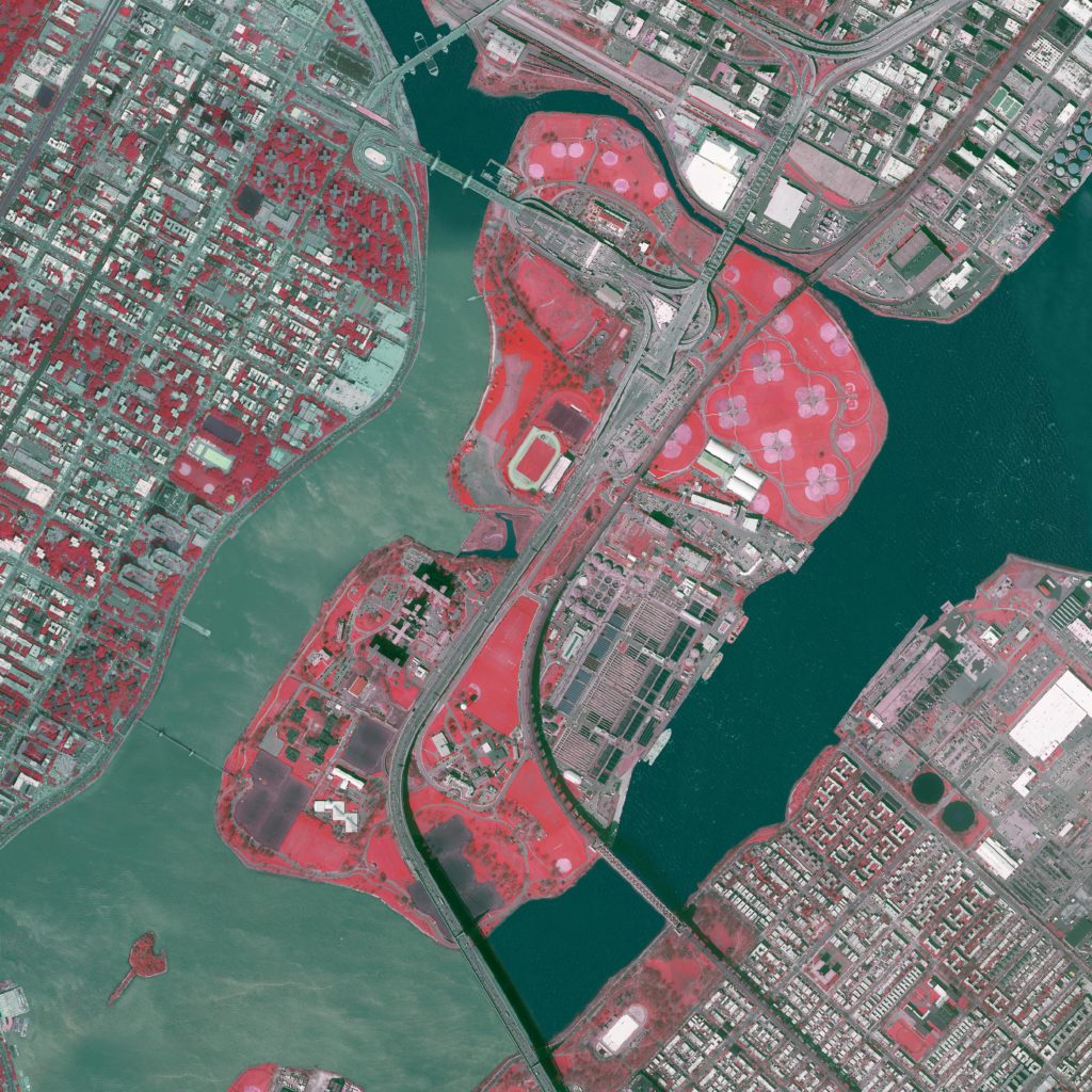
Both an RGB image (Spectral Bands 123) and a near-infrared image (Spectral Bands 432), in which vegetation is identified by red hues, were hue sorted. Different base images identify different aspects of the landscape. Sedimentation made evident in the RGB image is less evident in the near-infrared image, as the contrast between vegetation and built form takes precedence.

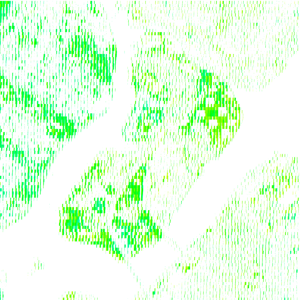
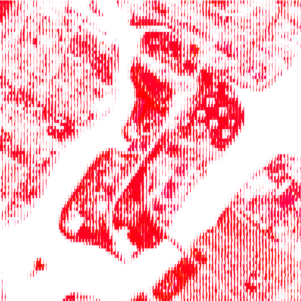
The “greenness” found in the two base images was compared by clipping the sorted pixels to include only the green and red hues, respectively.

Images were produced using Processing. The pixels of an image were subdivided, whereupon pixel hue values were looped through within each subdivision. The collected hue values were then sorted and redrawn within the subdivision’s extent. In the clipped RGB image, only hue values between 70 and 160 (of 360) are shown, and in the clipped near-infrared image, hues between 0 to 15 and 340 to 360 (of 360) are shown.