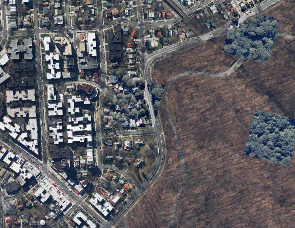
Parallel and Perpendicular (029)

Parallel and Perpendicular illustrates the particularity of New York City’s many street grids, contrary to its imagined uniformity.

Streets are color coded by bearing angle to reveal a patchwork of many grids, knitted together and bisected by criss-crossing lines. Even in Manhattan, the exemplar of regularity, a red diagonal cuts through a sea of green.

Rainbows circumscribe islands: purple turns to orange turns to blue as the Bruckner and Major Deegan Expressways encircle the Bronx or as the Belt Parkway and Gowanus Expressway define Bay Ridge. The streets of Staten Island stand in contrast to the grids of the other boroughs. The patches are smaller, less distinct, and often made of curves and cul-de-sacs rather than straight lines.
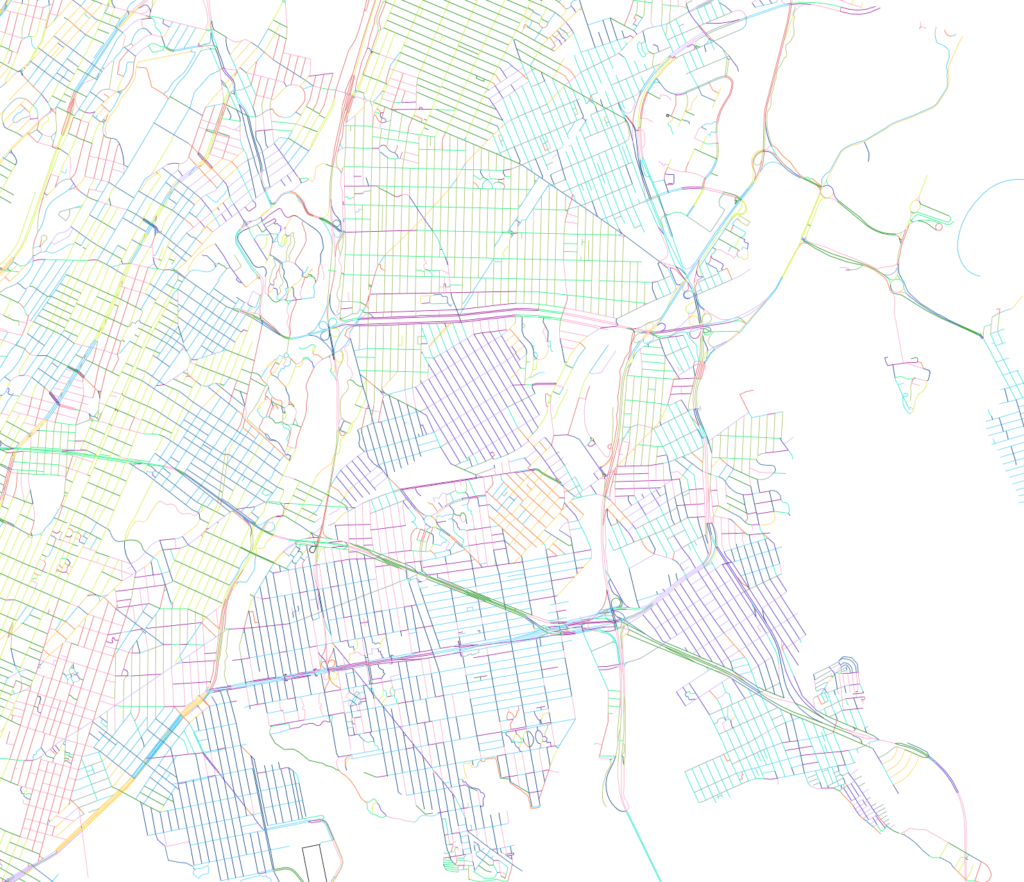
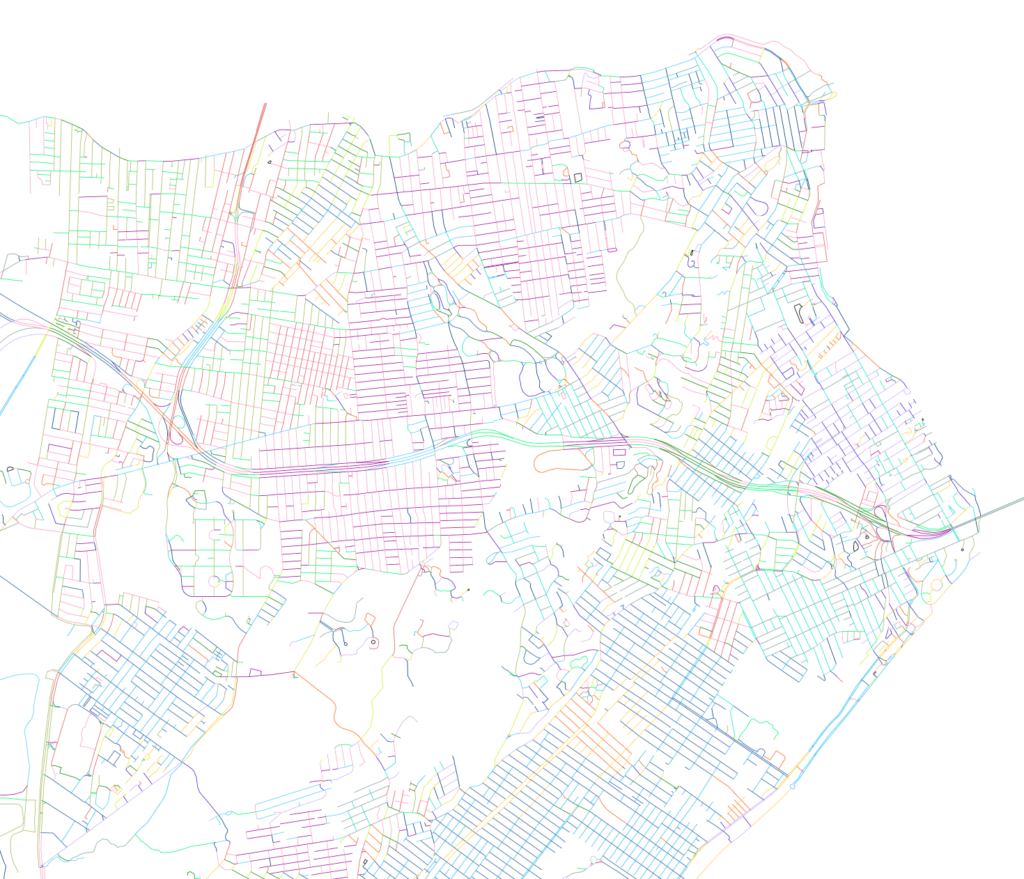
Does the extent of directionality figure into one’s imagining of a neighborhood? Do parallel and perpendicular lines in an area have the same extent? Why didn’t the relative uniformity of Manhattan extend to the other boroughs? How do straights lines identify a neighborhood differently than curved lines?

On click, streets within a -2.5/+2.5 degree range are isolated, and density and grain is made evident. Even though a street may have a certain angle, it may or may not form a neighborhood with streets at the same angle.


Technicals

The bearing angle of each line was added as a property using QGIS. The formula for determining this angle was found in a post (https://goo.gl/zSifeS) on GIS Overflow — a discussion board for technical GIS questions. While the formula originally mapped from 0 to 360 degrees, for the purposes of the map, the domain was adjusted to -180 to 180 and the absolute value was used.

Next Steps
  • Improve performance by resolving loading time of the large street grid GEOJSON file.
This is What I See (028)

This Is What I See — But Not Really examines how Google street view shapes our imagining of the city by displaying images corresponding to one’s current location.

Google street view is historical. The imagery might represent a recent condition, but at least for now, it doesn’t represent the current condition. Yet, when we aren’t in a particular location, the ubiquitous imagery is assumed to represent the current condition of a place.

Thus when viewed in-situ—updating as you walk—the historical nature of the imagery is foregrounded. The images flicker from day to night, between weather and seasons, and from changing perspectives. This frenetic movement is in contrast to the seeming linearity and contiguity of the single perspective observed while walking. Here, the institutional imagining of place is juxtaposed against the personal experience.

“This Is What I See — But Not Really” is an alternative view of the same place, one that is remarkably different from the immediate experience.

Technicals

In order to access a user’s geolocation, the site had to be HTTPS, which required purchasing and installing an SSL certificate. Additionally, any libraries — in this case, JQuery — needed to be served from an HTTPS CDN.

Once enabled, the site accesses a device’s geolocation with the navigation.geolocation methods. The user’s position is continually polled by using the watchLocation() function. When the position changes, a new image is obtained.

As with Every Borough Has A Broadway, the street view image is obtained from Google’s static street view API by feeding it latitude and longitudinal coordinates.

Couple with:
  • Movie Recutting (forthcoming)
  • A Different Similar Center (030)

Flat Incline (027)

Flat Incline offers an alternative representation of terrain in Washington Heights. Distinct from topographic contours — which describe a continuous line of height — here, a similar domain of height is described by variable square areas.

In reading the unfamiliar view, one asks:

  • How does built form change with respect to terrain?
  • Where should terrain be measured from in a building, the basement or the roof?
  • What areas are flat and which are isolated by steepness?

Zoom, and thus scale, has been restricted. However, users can pan, and a slight change in extent changes which pixels fall into which evaluation areas. As a result, panning changes whether an area is considered steep or flat, and forces a re-evaulation of the questions above.

A slider toggles what parts of the original RGB image are seen, clipping to subdivisions of a particular size.

Technical

Pixels from a rendered Digital Elevation Model are evaluated to find the height differential for an area. If the difference is greater than a given threshold, the evaluation area is subdivided and each subdivision is re-evaluated. This process continues until the height differential of all following subdivisions is lower than the threshold or a minimum evaluation area has been reached. The result is a grid of squares, in which smaller areas indicate steeper terrain while larger squares are relatively flat.

NB: The top surface of built form is included in calculation of height-change over an area.

Next Steps
  • Similar study, but where the threshold is configurable with a slider.
  • Allow users to select an area on hover, instead of with a slider.
  • To improve the illusion of performance, draw the subdivision incrementally to the screen as they complete (refer to Dan Shiffman’s recursion tutorials)

Pan Pan Pan (026)

Pan Pan Pan (works best in Chrome) describes two data handling methods used to pan an image digitally. Six frames pan together synchronously to illustrate how a RGB value and its data structure form an image, either as a single two-dimensional array or as a series of two-dimensional arrays called tiles.

The six frames study different aspects of panning. The first is an image of the full extent with a rectangle locating the cropped frame. The second is the cropped frame at the same scale as the full extent. A pair of images show the cropped area, but one is tiled and the other is not. Lastly, a pair of gridded numbers echo the previous pair to describe the index values of the single array and within each tile.

Panning is a process of showing a sub-extent within a larger image. Yet, a tile is simply another level of order in the same data — an array within an array.

Why Pan

Panning changes adjacency — part of an image is brought into view, while a previously visible part is removed. The visible features form new relationships: a house may have a pool in one instance while it is out-of-frame in another, parks can be boundless or circumscribed, and streets to nowhere end somewhere.

Technicals

The exercise implements a custom tiling system—rather than using Mapbox or Leaflet—which allows for greater flexibility for image processing. The pixels from each frame and within any extent can be captured and evaluated independently but also relatively.

Next Steps
  • Introduce 16 tiles. With more tiles, ensure that only those on screen are loaded
  • Remove tile number from image
  • Make zoom scale the same as Zoom Zoom Zoom (fixed at 1/2 of height and width)
  • Solve cross-browser bugs

Glendale Slide (025)

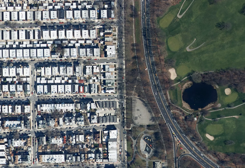
Glendale Slide follows a constructed divide between built and “natural” in the Glendale and Forest Hills neighborhoods. The slow-moving animation encourages one to see the differences in areas that might otherwise appear homogenous.

What is generically identified as “green space” is actually a small mausoleum city, parched baseball diamonds, overlapping racquet courts, and artificial turf. Built form also becomes differentiated: houses with front yards stand against the long shadows of the apartment towers, and the linearity of the rail lines wind between the flat, white roofs of industrial buildings.

Technical

Glendale Slide builds on the first map of the series, The Slow Shore Shuffle, which traced the defining land-water divide of Staten Island. As before, regular points along a polygon were exported from QGIS, modified in Rhino, and then exported again to a GEOJSON file. On refresh, a random start point is selected and the map pans slowly along the path. Occasionally, an odd image tile taken at a different time from its neighbors will even appear.

An aerial image showing a wide road dividing green space from housing.

Next Steps
  • Walk the same path that is traced in the animation.