My focus this week has been culling through the footage and pairing shots within the same geographies – i.e. two videos from the station perspective or two videos from the train perspective. Below are a series of screencasts that show the mouse movement interaction of switching between one side and another. Each video within the pair is continuously looping so when watching one, the user is missing out on what’s happening in the other. Some footage is used in different sets of pairs, but through the juxtaposition, different aspects of the content are emphasized.
Category: Alt Docs
Fall 2016
Taught by Julia Irwin and Ziv Schneider
Collecting Content and Adopting Techniques
The subway project continues to develop around three central geographies: the train, the station and the neighbourhood and examining these each as individual contexts—illustrated from within—but also as connected contexts—illustrated by moving between.
- The train is a context where many narratives converge and diverge; a continuous space of renegotiation and shuffling. It oscillates between moments of intense speed coupled with minimal but constant noise (the whurring of wind, the regular clicking of the track) to complete motionless with an outburst of excuse me’s, door dings, and alerts to “stand clear of the closing door”.
- The station is an island yet functions between the spaces of the train and the neighbourhood; it is the bridge and an interstitial space. It is slow and quiet until suddenly it is not: a train whizzes by!
- The neighborhood lives above ground, where the people provide the connection to the station, and secondarily to the train. However, sound seeps up from below through air grates with the rumble of a passing train or up the stairs with the people.
With Empire as a strong reference, I’m interested in what happens when applying their methods and juxtaposition techniques to alternative content? In Empire’s case, the narrative is driven by the personal, human stories. But if the subject of my piece is an object (the train) and a place (the station or neighborhood) rather than a person, are the techniques still appropriate? Can they be used to highlight the people within the very structured environment?
In order to test these questions, I’m considering using the same footage from each of the geographies (the train, the station, the neighbourhood) but reconstituting them through different frames of juxtaposition.
Pairs, but Separate
The first proposition is a series of diptychs, one for each geography. Each diptych is composed from two fixed-camera perspectives within the geography, but the user can only see one perspective at a time depending on they mouse position. Each side of the diptych is running simultaneously while watching the other. I’ve created a couple prototypes experimenting with the relationship between different shots. (Static images to be replaced with embedded videos…)


Note: I need to shoot more Neighbourhood footage to build out its geography.
A Triptych
Another proposition is a triptych in which the user has no control over what is playing and what is being watched. Footage from the train, station and neighbourhood is shown simultaneous. The train footage plays continually, but alternatives between the station footage and the neighbourhood footage when stationary or in motion, respectively. Note: The neighbourhood footage doesn’t feel appropriate for this at the moment. The emphasis is on the gateway down to the underground versus the neighbourhood as a context. Perhaps reframing the shot would change the focus and make clearer the relationship. Additionally, maybe there needs to be more alignment in movement like there is between the train and station shots. People exiting the stairs could correspond to when the train began moving in the middle shot.
The Subway and The Station
My final project for Alt-Docs proposes a web-doc about the subway as a place and space, as a character.
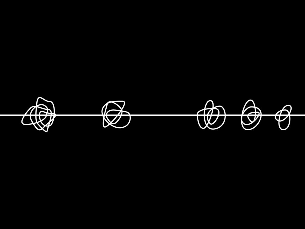
A subway train often exists between contexts (the stations) and acts as a context itself for the activity that takes place. When between stations, there’s a calmness within the subway car, but once in station and with its doors open, the subway car undergoes a reshuffling.
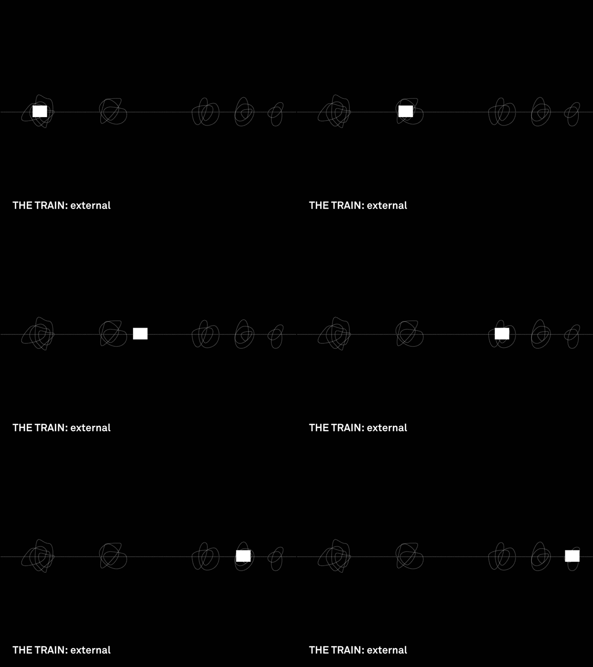
In relation to the stations, the train connects these fixed and disparate world.
The movement between these spaces is largely devoid of context, often travelling in tunnels without lights or changing scenery which typically orients people through travel. In this way, the train car and its people are simultaneously the context and the characters.
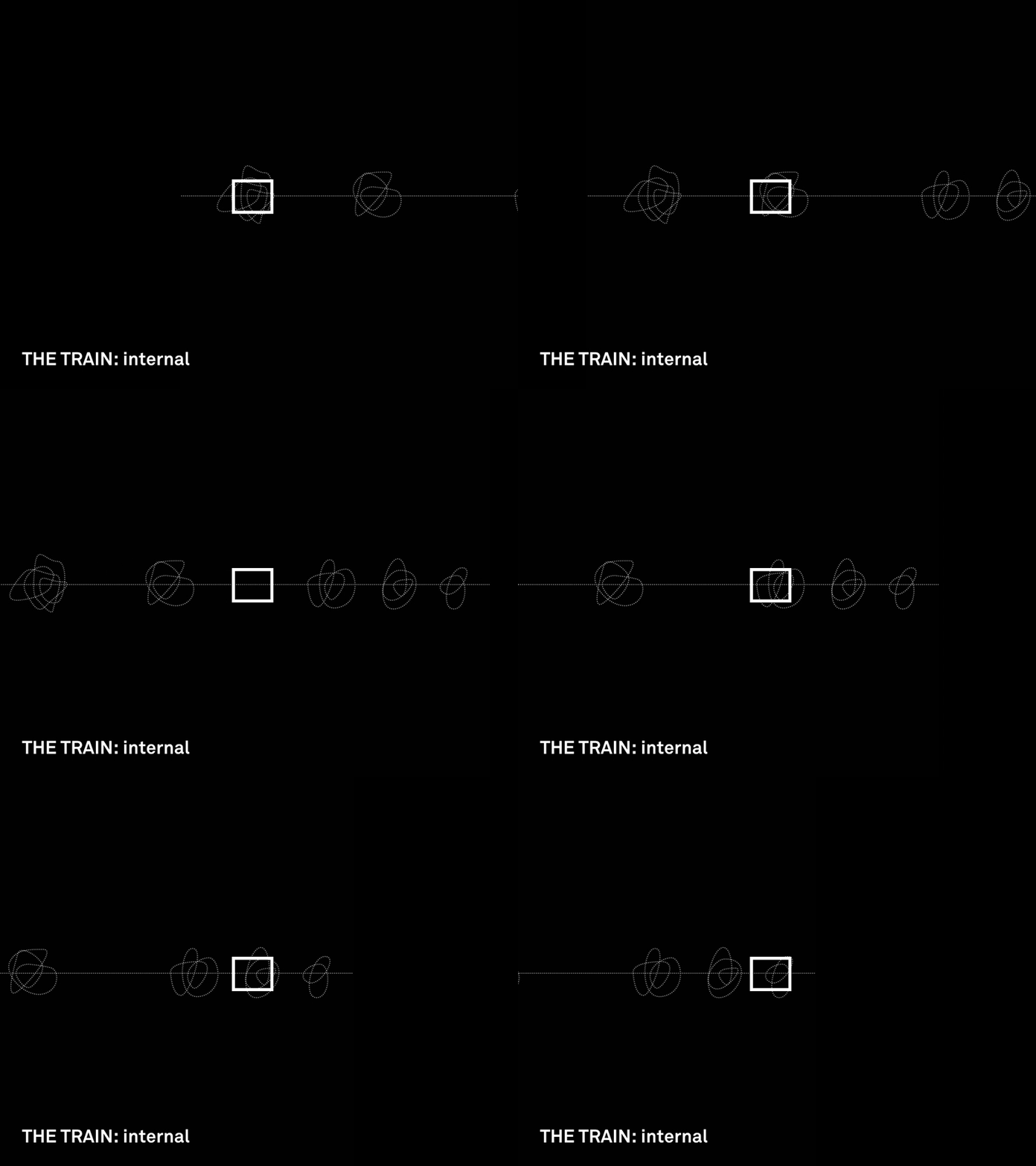
This external movement of the train between stations is juxtaposed with the internal stasis and consistency. The people are a step removed from movement: the train is moving but they are stationary. They’re also isolated from the external city as a context. In alternative modes of transportation such as riding the bus or walking, people physically see the change in location.
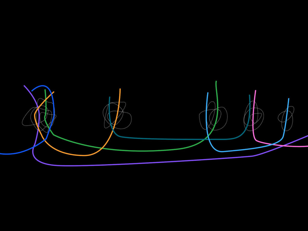
Manifestation
The web-doc will present series of video pairings, juxtaposing the train and the station. The user interaction will focus on switching between or controlling the presence of the two videos.
Potential Shots
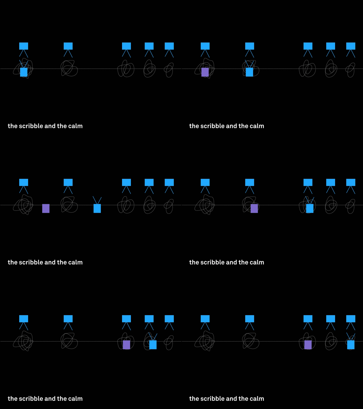
One camera is stationed in the train, and rides the line from one end to the other. This would be paired with fixed shots from several stations along the same line. These shots would have fleeting moments of shared movement but it would also highlight the disconnect/isolation within the train as the station shots picking up other trains (purple) while the “main character” train is only “knows about” its existence.
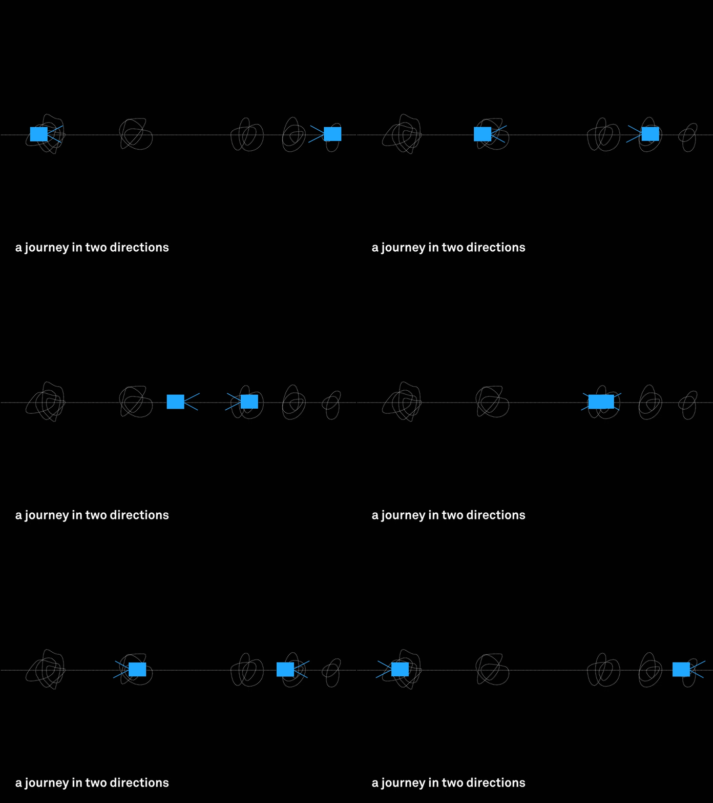
Two simultaneous videos of the train are shot from either end of the line. They overlap for a moment in the middle. But how does this relate to the station?
Audio
The audio track for each video pairing will provide an imagined narrative. But it will be constructed from overhead conversations recorded on the train, audio book recordings of what people are reading, clips from songs the subway-riders are listening to, etc. The composited audio hopes to bring together the paired videos into a single narrative.
The Question Bridge
The Question Bridge is a multi-format documentary that explores the multifaceted identifies of Black men in America. Initiated in 2012 by artists Chris Johnson, Hank Willis Thomas, Bayete Ross Smith and Kamal Sinclair, it has since been exhibited as a video art installation, translated into an interactive website and app, and formed an education curriculum for high school students.
Narrative
The piece is composed of video interviews with individual subjects which are collectively brought into relation through a question-answer sequence, a technique called the “Question Bridge”.. Although the various subjects are not speaking directly to each other, the sequencing of the footage puts them in conversation with one another—asking and responding. This format of interweaving the various stories showcases the layered, complex and multidimensional identities and narratives of the subjects. By presenting narratives which both enforce and contradict each other, the artists attempt to dismantle and frustrate the media’s presentation of a presumptive singular identify that “Black Males are.”
Format
In the “Explore” mode on the interactive website, the content can be explored through two lenses: the conversations or the individual profiles. A second layer of organization provides navigation by index, geography, or tag.
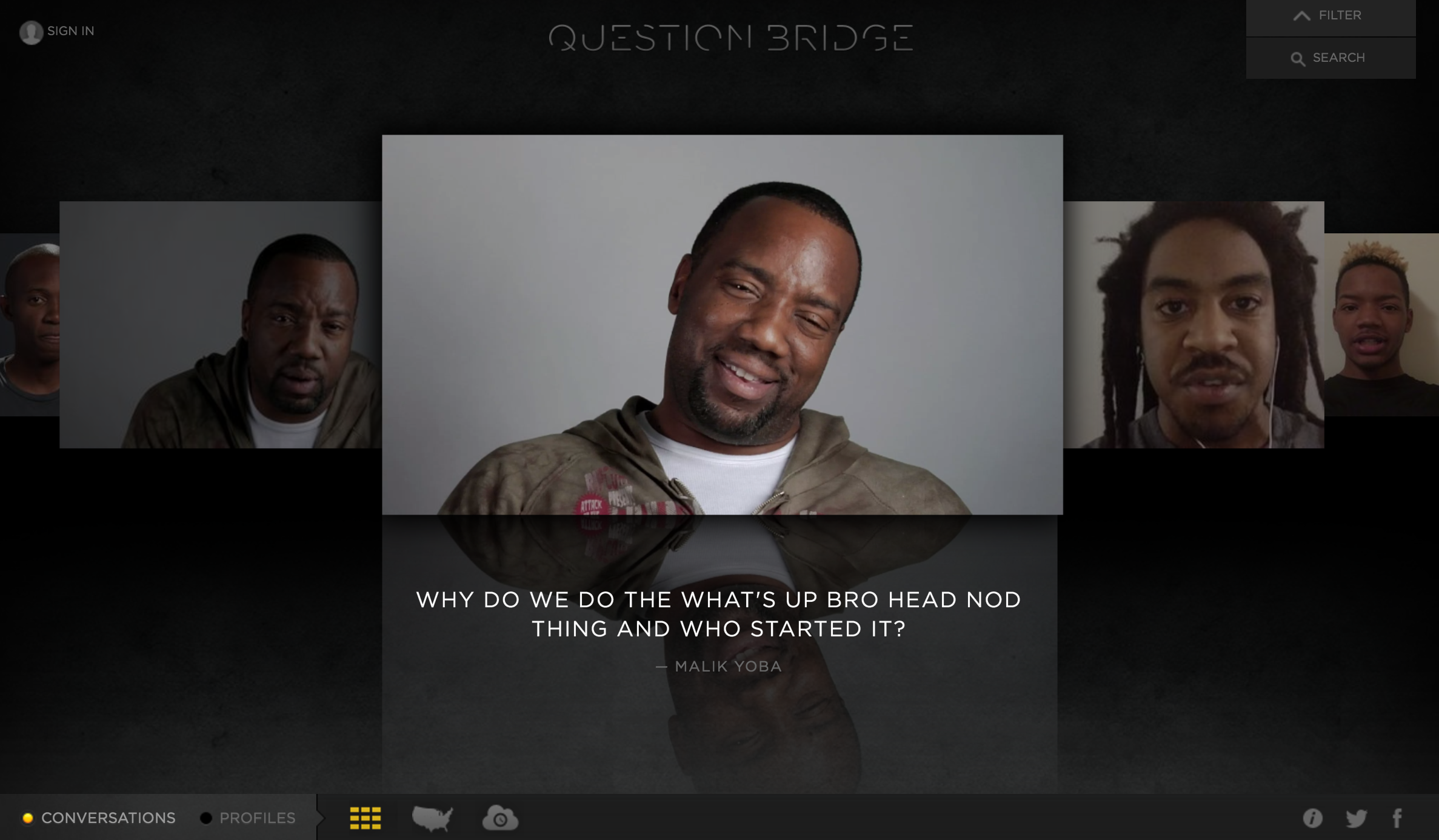
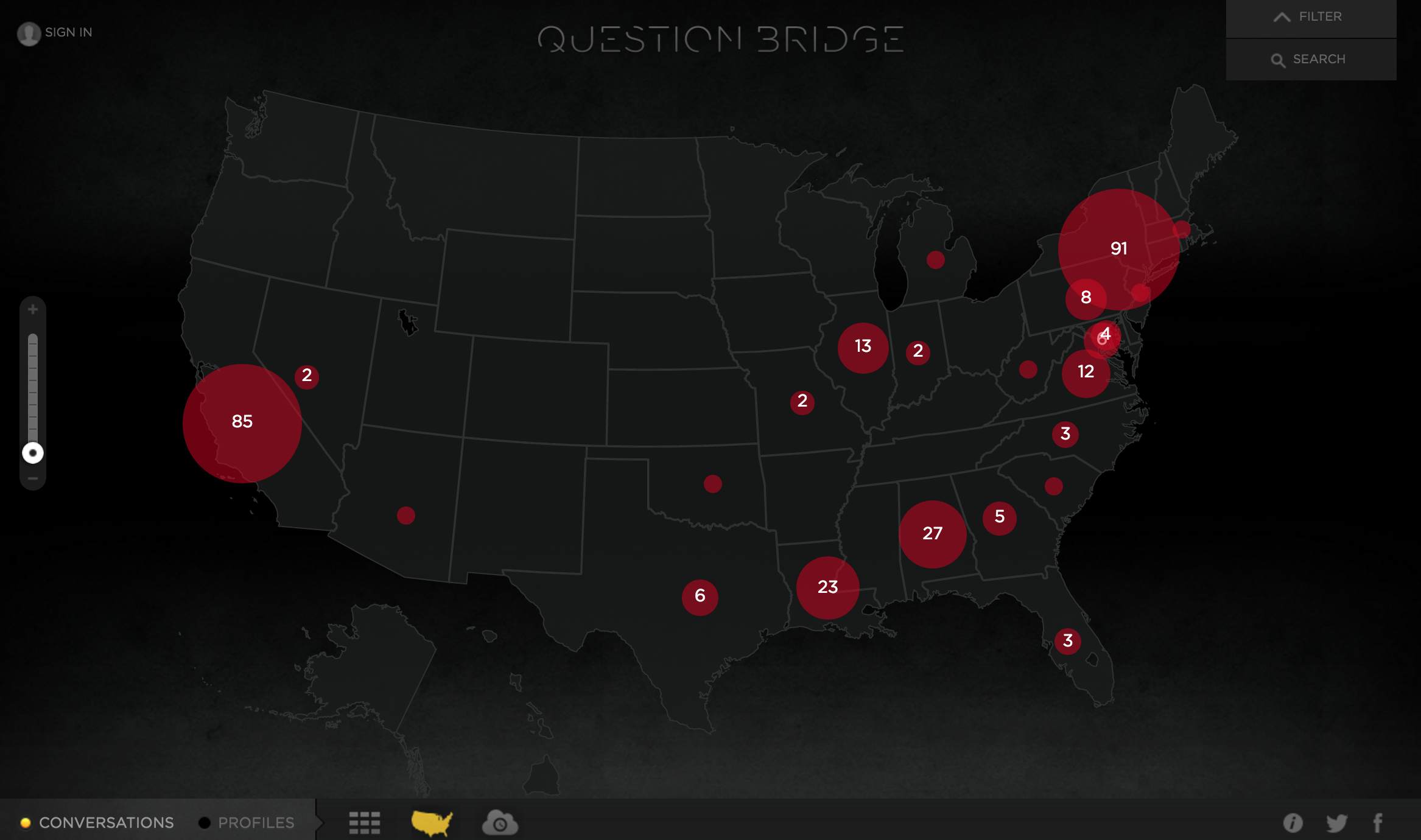
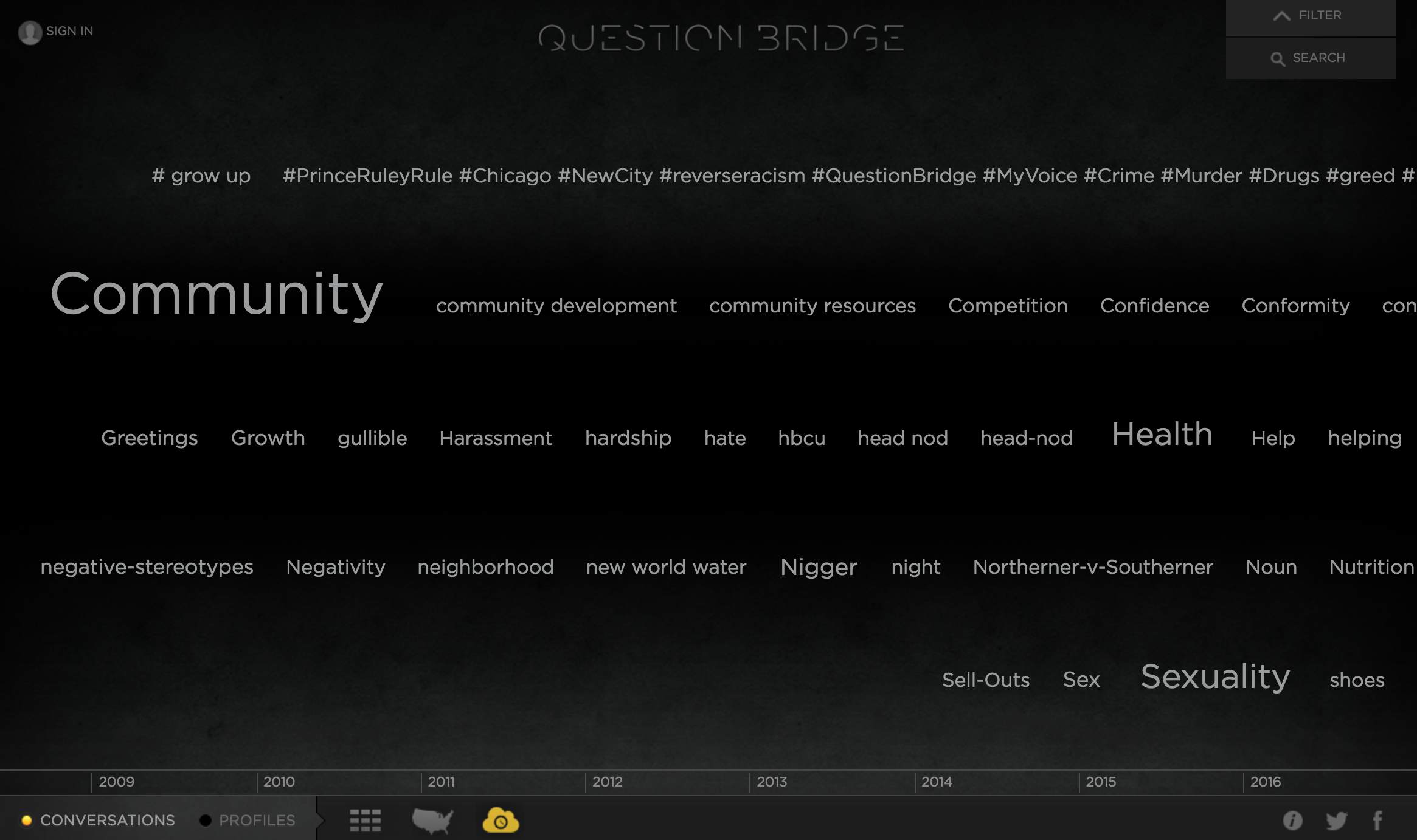
For interfaces that provide a multitude of navigational and organizational structures, I often wonder whether the piece would be stronger with a single mechanism for organizing the content? Are users overwhelmed by the many ways in which they can explore and does this overshadow or distract from the content itself?
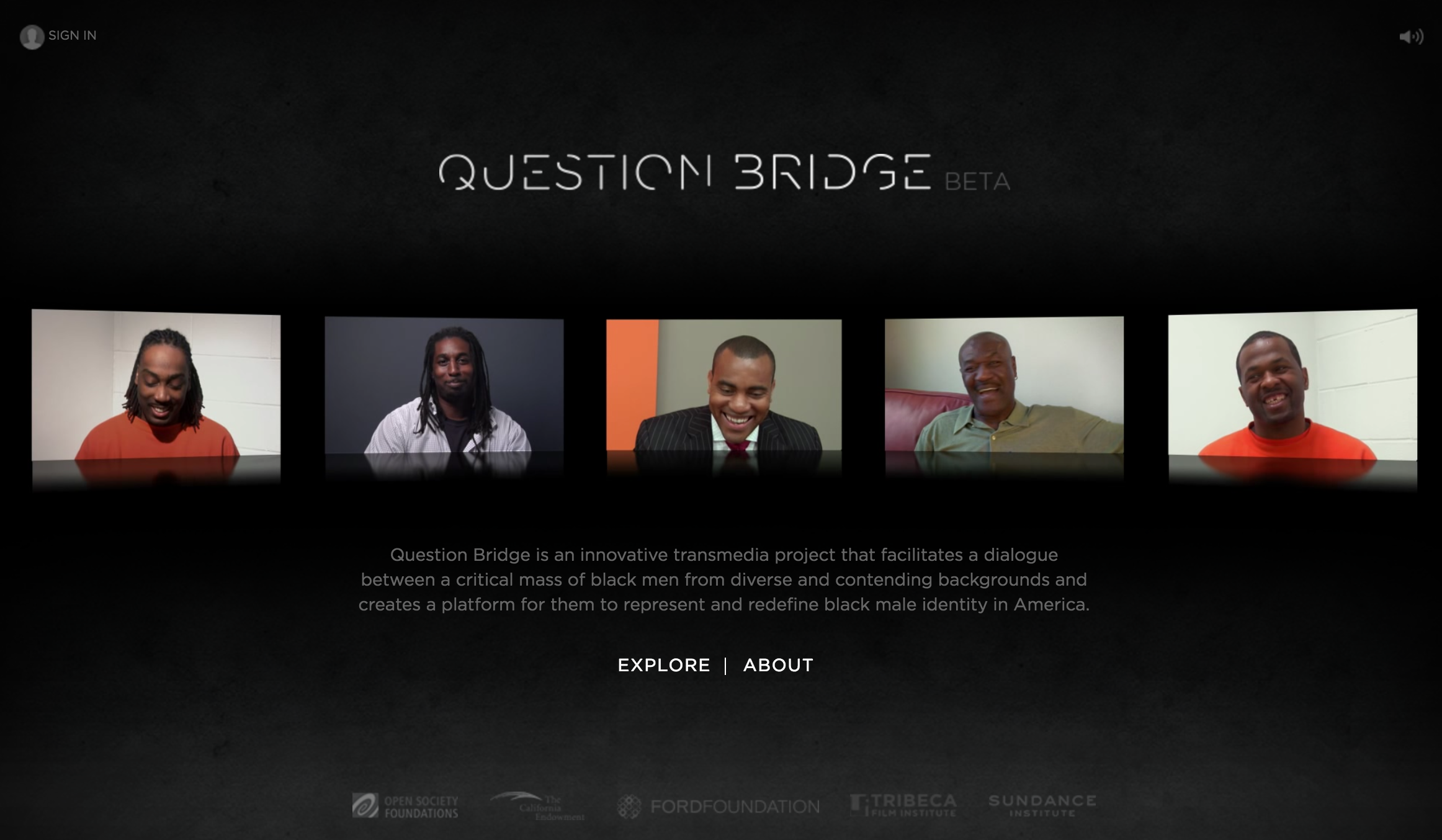
The homepage arguably provides the opposite level of agency to the user. Various videos composited from multiple clips automatically play when a user visits the page. The artists have created a narrative out of the individual clips, placing them visually side by side and playing them in a predetermined sequence.
These two formats provide the user with different levels of agency and in turn the two formats respond to the idea of “narrative” differently. The “constructed” narrative playing on the homepage presents a point of view established by the creators. They have chosen how long each clip plays, the sequencing of the clips and which clips respond to the question asked. In contrast, the “explored” narrative is continually being constructed as the user engages with different clips.
What underscores both narrative forms is the consistent directorial style. The subjects of the videos all speak directly into the camera, simultaneously engaging with their fellow video subjects but also with the viewer. Through this technique, viewers are intimately placed actively within the conversation rather than positioned passively outside of it as an observer.
Spatializing Information
We often discuss the browsing the internet with language similarly used in descriptions of exploring physical space. We get lost in the links, we forget how we ended up somewhere, websites leave breadcrumbs behind in the form of cookies. While the browser history indicates a very linear sequence of the websites visited, I imagine my perusal of the internet more as a web: one link branches to three other links and from each of those I open up three, four, five more.
In translating my recent browsing history, I was curious about the possibilities of spatializing this archive; what is the benefit of space as opposed to a two-dimensional infographic?
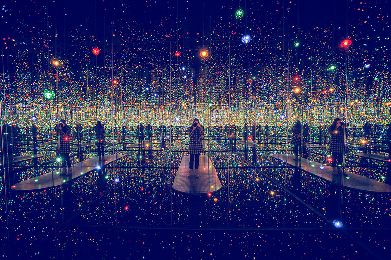
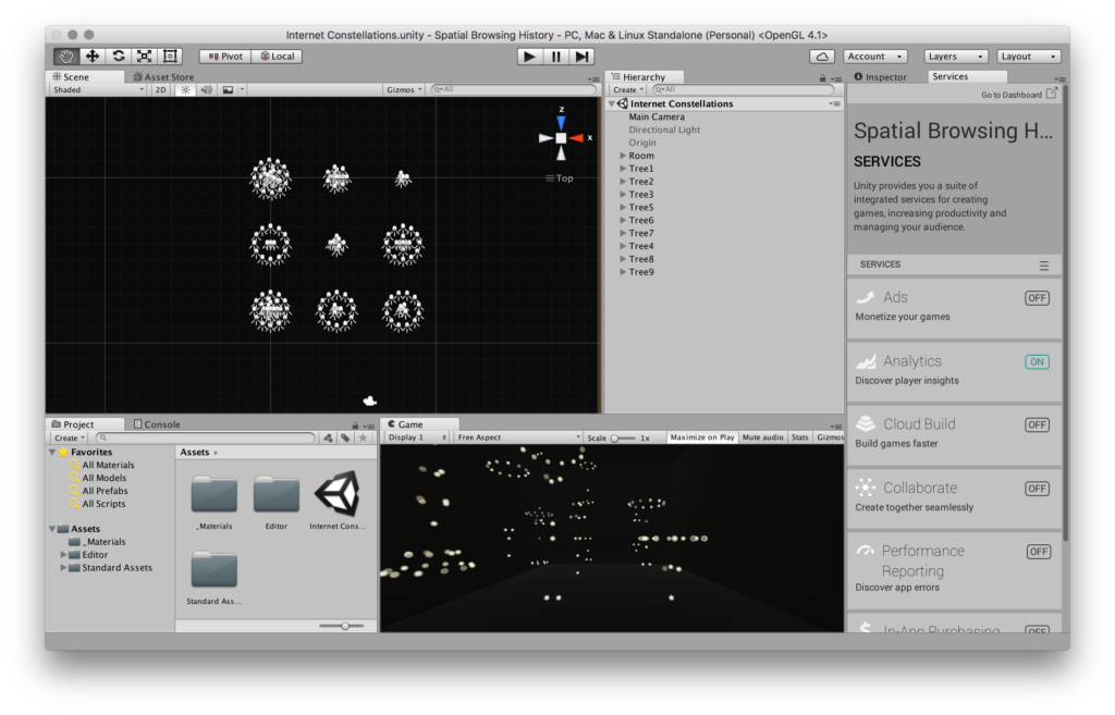
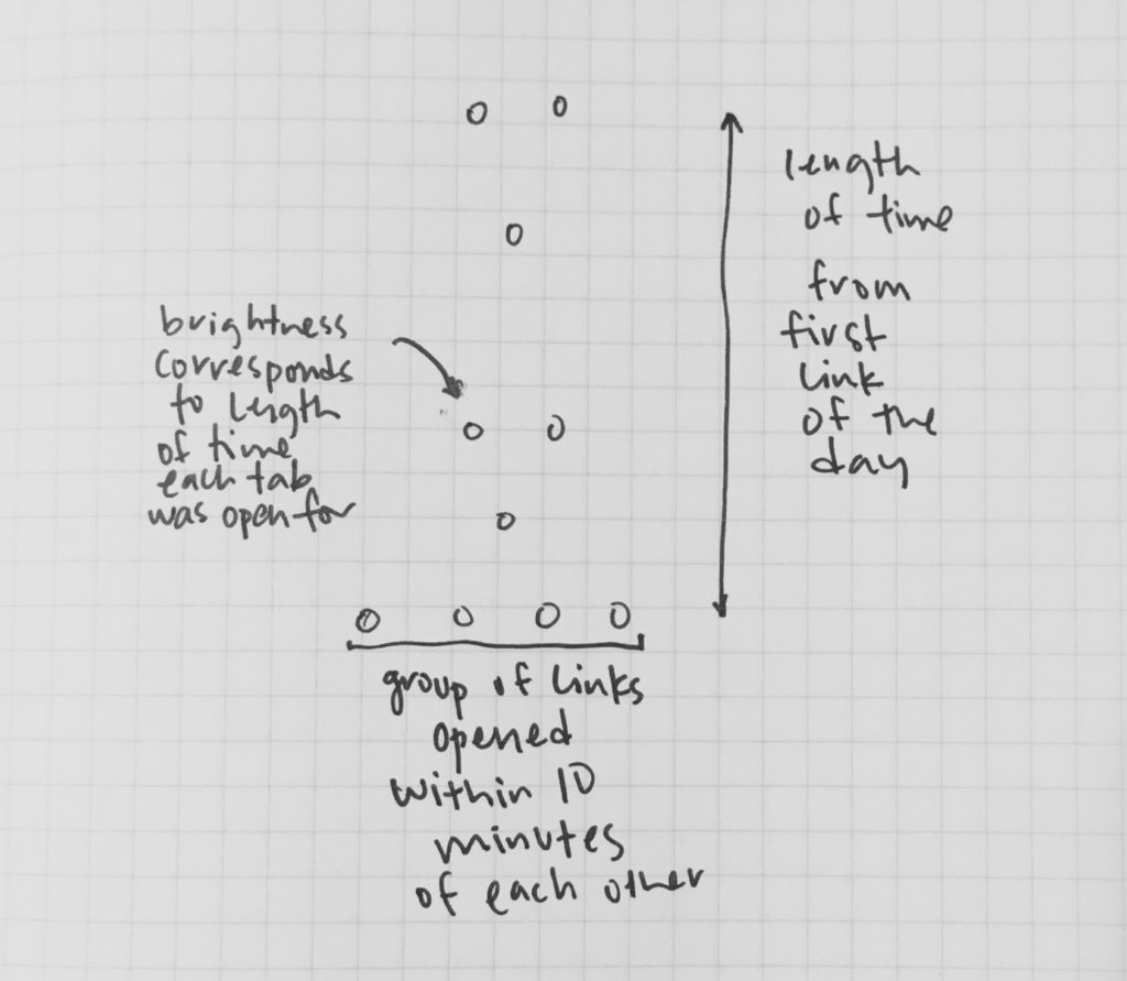
The proposal is a light installation. A black room is lit only by a grid of constellations, each representing the time-relationships of websites visited in a single day. The room itself recedes and its hard edges dissolve in response to the “endlessness” of the internet. Furthermore, the spatialization and distribution of the lights into a grid removes the linear sequencing of the recorded web browsing. They form clusters and relationships, rather than a strict lineage. Lastly, through representing websites in space, how one “experiences” the story is a question of their body, and how they navigate within the physical space as opposed to an interaction of scrolling, clicking or typing.
Fine Details
I wrote an AppleScript to record when I opened a new link and when I closed a link. I also catalogued the URL and title of the webpage, but mainly used that for reference.
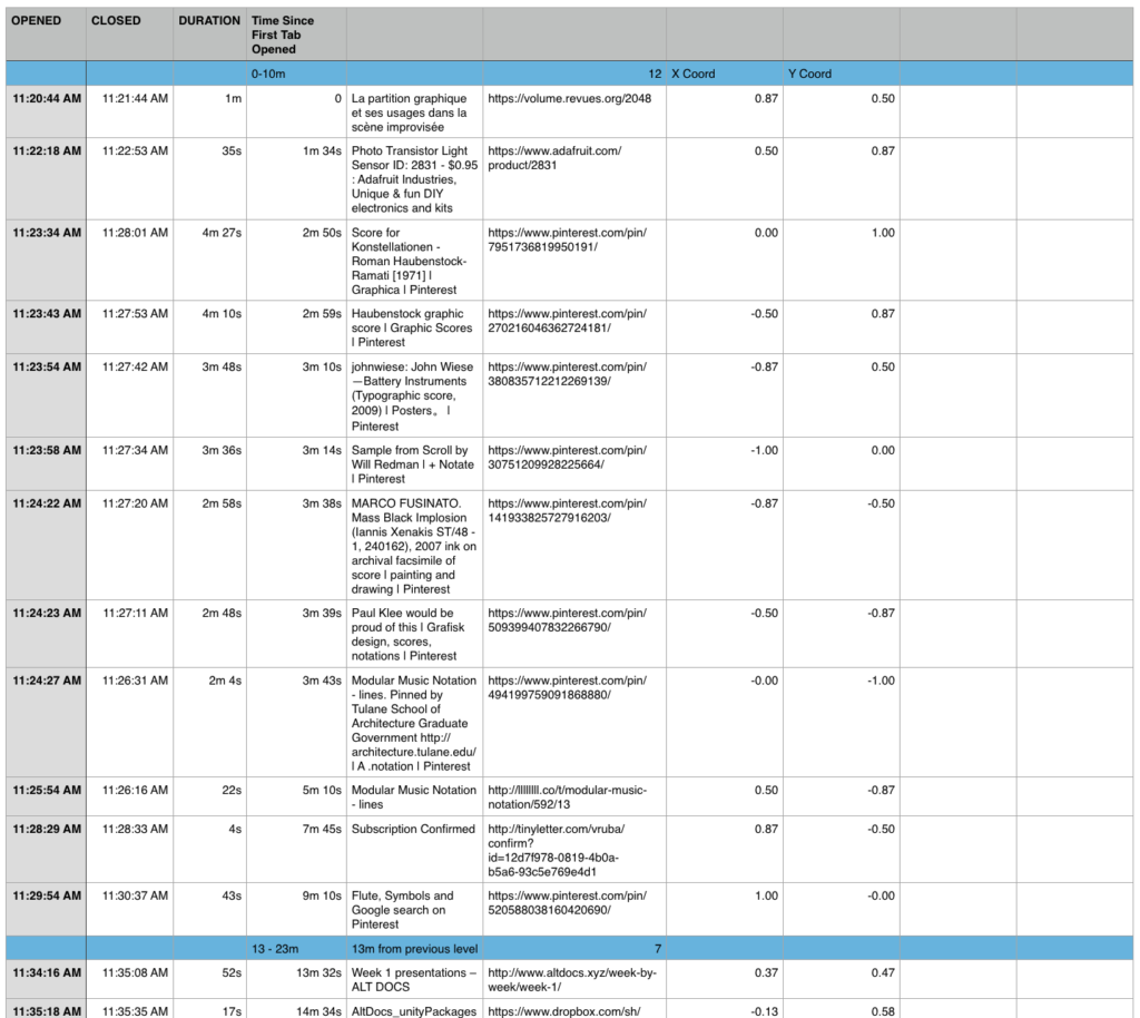
Through spatializing the data, I was less interested in the specific content as opposed to the opening and closing of tabs over time. I mapped the links in relation to when I opened my first tab of the day. Anything opened within 10 minutes of that formed the lowest ring. The second ring was then vertically located in relation to how much time had passed since that first link, and again cluster anything within 10 minutes beyond that.
Precedents
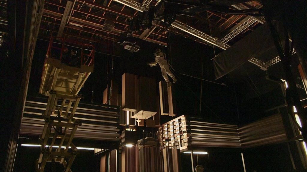
Christopher Nolan’s 2014 film Interstellar conceives as time as a fifth dimension through which the bulk beings can communicate using gravity. Every moment in time — the past, present and future — are all accessible and manipulatable within the Tesseract. An article by Colossal discusses how the tesseract was constructed as a physical set with which the actors could interact rather than a digital effect added in post-production.
Borges’ Library of Babel
”I declare that the Library is endless. Idealists argue that the hexagonal rooms are the necessary shape of absolute space, or at least of our perception of space…Let it suffice for the moment that I repeat the classic dictum: The Library is a sphere whose exact center is any hexagon and whose circumference is un attain able.”
Yahoo Kusama’s Infinity Room
