Subway at Grade (008)

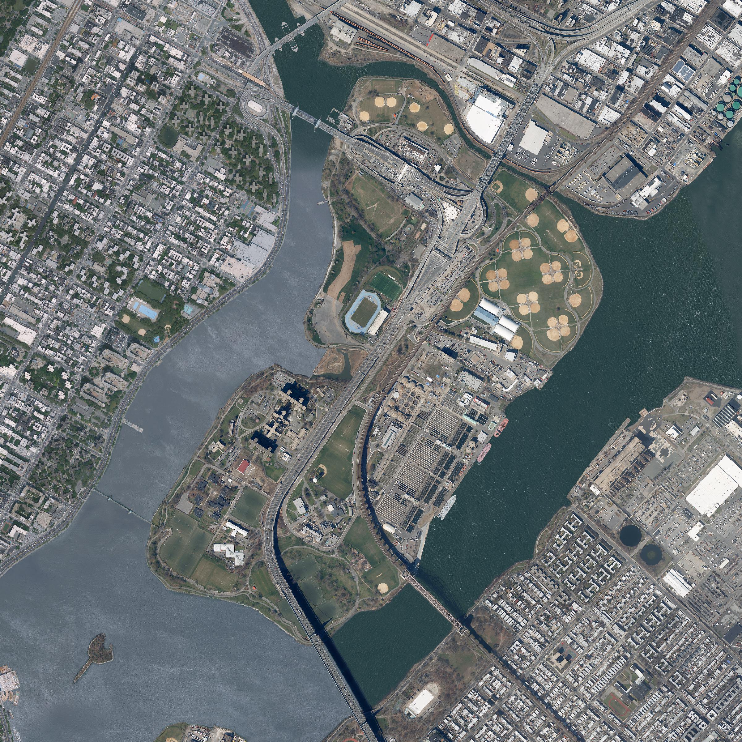
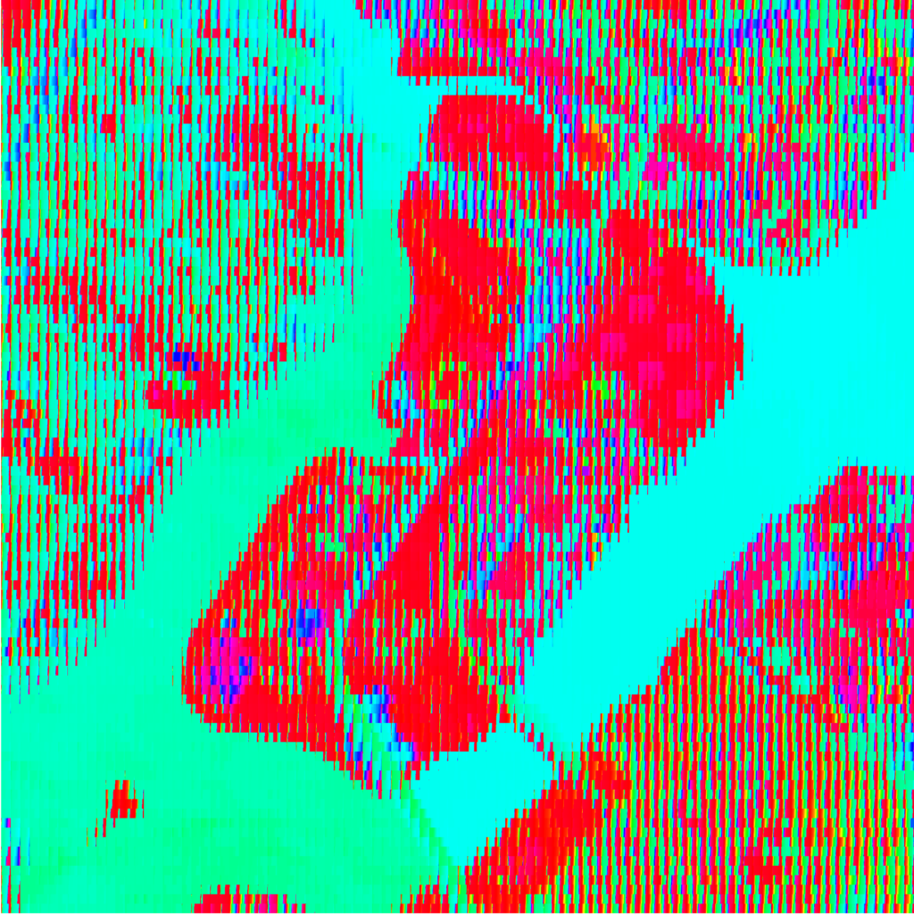
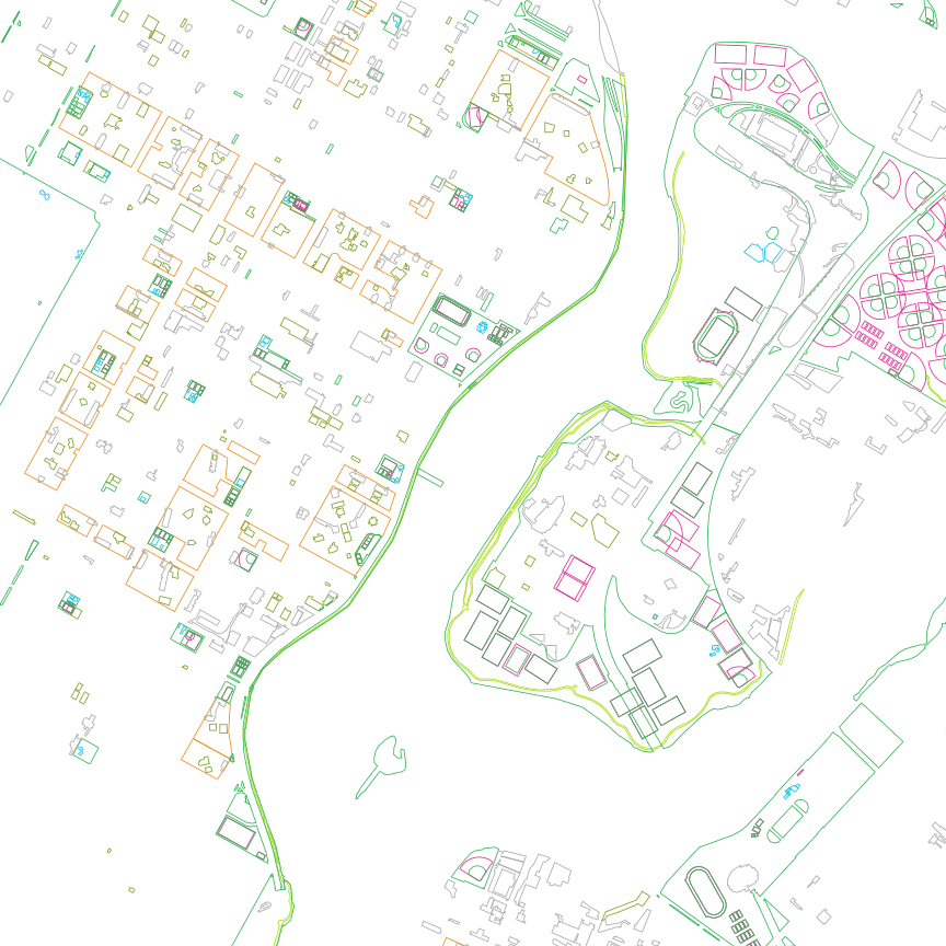
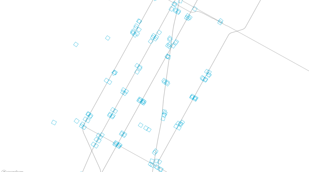
“Subway at Grade” (live link) plots all subway entrances within New York City. Departing from a previous exploration — From City Island (006) — the map explores transit density and sparseness at the scale of the subway entrance. Why do some stations have many entrances and some only a few? How far are the entrances from the subway platforms? Were entrances always inside of buildings or did the buildings build over entrances?

By emphasizing scale over clarity, as in the standard MTA subway map, the irregularity and idiosyncracies of the system become more evident.

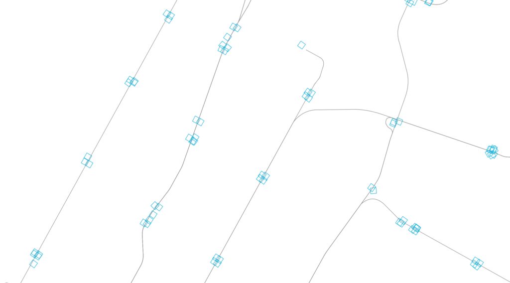
When an entrance is clicked, the map zooms to the location and shows the corresponding aerial. After a few seconds, the map zooms back out and the aerial fades.

The map is displayed with Mapbox GL, and Turf.js was used to manipulate data. The footprints of the subway entrances themselves are very small, so an offset around each was created. First, a radial buffer was determined around each centerpoint, around which a bounding box generated a square extent. The square was rotated to match the orientation of the entrance. The angle of rotation was calculated using Math.atan() on the slope of one edge. Rather than dynamically create these offsets on the client-side, they were saved as a GEOJSON feature collection and loaded with the other GIS data.

The aerial mask was achieved by differencing the clicked station object with the overall map extent, and overlaying a solid white fill.

Next steps:

  • Add outline of subway station footprint below grade, if such data exists
  • Adjust colors of subway entrances to correspond to their line
  • Add labels for each station on click
  • Show nearby aerials also when zooming to particular stations
  • Add a mode to show aerials above each entrance in a grid, grouped by station. This removes the geographic space between them to give new adjacency and meaning.
  • Options to try:
    • On click, zoom in to a slightly larger image (but more cropped than currently), which reorients to ortho and shows other images of the entrances at the station (in a row) and the other stations (stacked rows) – maybe it slowly auto scrolls? Four or five rows visible?
    • Only show route lines on click (connect the stops on the particular line
    • Sidebar with grid of images for each subway stop on line (one row per station)
    • Export images of each subway station from QGIS? Or, can it be done by grabbing the images clientside from the canvas? (probably not good from a perf. standpoint)

Finding Green (007)

“Finding Green” (live link) divides an aerial image into subdivisions and sorts the pixels within each by their hue value. The sorting makes evident the dominant hue in each image, which are further exaggerated, and conflated, by saturation and lightness.

At its full extent, prominent hues are immediately recognizable; however, on closer inspection, the variety within subdivisions becomes more clear. What do these hues represent? Is “green” an adequate proxy for parkland?

Both an RGB image (Spectral Bands 123) and a near-infrared image (Spectral Bands 432), in which vegetation is identified by red hues, were hue sorted. Different base images identify different aspects of the landscape. Sedimentation made evident in the RGB image is less evident in the near-infrared image, as the contrast between vegetation and built form takes precedence.

The “greenness” found in the two base images was compared by clipping the sorted pixels to include only the green and red hues, respectively.

Images were produced using Processing. The pixels of an image were subdivided, whereupon pixel hue values were looped through within each subdivision. The collected hue values were then sorted and redrawn within the subdivision’s extent. In the clipped RGB image, only hue values between 70 and 160 (of 360) are shown, and in the clipped near-infrared image, hues between 0 to 15 and 340 to 360 (of 360) are shown.

From City Island (006)

“From City Island” (live link) describes public transit lines directly available from a point in the city. Panning around the map reveals both sparse and dense networks of accessibility.

In contrast to system-wide maps showing all modes, routes, and transfer points, From City Island represents only the points of departure nearby. Where can one travel to on a single line? To how many different places? How far?

Aerial imagery is shown while panning; clicking anywhere centers and refreshes available routes.

Stops (subway and bus) and routes (subway and bus) were exported from QGIS, and imported as GEOJSON objects to the web map. The map is centered on a random start point selected from a list of coordinates. Using turf.js, a 0.8 km buffer was created around each start point, bus and subway stops falling within this buffer area are then isolated. The subway stop objects include a route property which was used to filter the route GEOJSON object. These corresponding routes were then added as a layer to the map. The MTA Bus Time API was used to find the route corresponding to each nearby bus stop. Once the information was collected from the API, the local and express bus routes GEOJSON objects were filtered and drawn.

Next steps:

  • Reverse colors: subways are currently black and buses are colored
  • Display nearby stops for buses and subways.
  • Add ferry routes
  • When a user stops dragging, use the release point as the new center point.

Tile Swap (005)

Tile Swap reconfigures aerial imagery of New York City. Newfound edges of each tile draw attention to previously unnoticed boundaries and continuities within the photograph.

The image is subdivided and tiles are randomly paired and swapped. New logics are formed, and the misalignment is either heightened or imperceptable: streets find new connections, houses have different neighbors, and water has unfamiliar shores.

When panning through areas of overwhelming sameness, difference arrives as a surprise — not at the perimeter of the overall map, but suddenly at an unexpected internal edge.

Tile Swap is built as a 2D-canvas element on top of a hidden webGL-canvas element from Mapbox. In having two separate canvases, panning is tracked in one while the modified representation is shown in the other. The Mapbox canvas provides the original tiles which are drawn to the 2D canvas as an image. getImageData() is then used to return pixel arrays at each grid point. The pixels in one subdivison are swapped with its randomized pair. The original mapbox canvas is hidden overtop the reshuffled canvas with an opacity of O.

Next Steps:
  • Add functionality for users to enter a custom location and change grid size
  • Explore whether tiles can be cut and reorganized along street centerlines
  • Use machine learning to explore blending the edges of tiles to create a new ‘place’

Points and Polygons (004)

“Points & Polygons” is a series of four maps representing physical and organizational forms of New York City. (Live links: 01, 02, 03, 04)

Dominant forms — building footprints, street grids, and topography — are intentionally absent. However, their structuring influence is latent in everything from catch basins that describe invisible intersections to the even spacing of hydrants, playgrounds, and libraries.

In constraining the interaction to only panning, the maps invite close examination, asking: What reasoning underpins the sporatic density of parking meters? Will the patterning of catch basins be imagined as a form of communication in a future archeological dig? What does the distribution of sports fields and playgrounds say about power relations in the city? What about the scale and location of housing authority properties? Is there such as thing as “Forever Wild” and can it be described as a polygon? Are there pools anywhere other than Mill Basin and Staten Island?

The maps are built with Mapbox GL’s API. Each shapefile was curated, then exported without modification as a GEOJSON object and loaded as an individual map layer. A mouse over function describes and isolates each layer.

Next steps:

  • The GEOJSON object for spot elevations was prohibitively large when loaded via the API. See if uploading to Mapbox Studio and converting to a tileset improves performance. January 17
  • Differentiate each layer internally by types (athletic facilities into tennis fields, pools, etc)
  • Add start points for each borough. January 17
  • Translate points into polygons for libraries, post offices and public schools (Points & Polygons 02).
  • Translate polygons into points for play areas, parking lots, athletic facilities and NYCHA properties (Points & Polygons 03).
  • Add a debouncing function to smooth the hover effect. January 17
  • Fill polygons with solid color on hover.
  • Add menu to page to allow jumping between maps without spacebar.
  • Allow visitors to take screenshots that can be added to a gallery.
  • Code the various point objects with symbols, e.g. squares, triangles, crosses, etc.
  • Add interaction for change to the next map while on a mobile device. The current interaction — pressing the space bar — doesn’t work.

Below is a list of selected data in each map:

01: Neighborhood (Points and Polygons)
– Catch basins
– Cooling towers
– Parking meters
– Hydrants
– Private pools
– Public pools
– Railroad structures
– Subway entrances

02: Polygon Distribution
– Athletic facilities
– Boardwalks
– NYC Housing Authority properties
– Open space, other
– Open space, parks
– Parking lots
– Play areas

03: Point distribution
– Bus stops
– Bus stop shelters
– Libraries
– Parking meters
– Post offices
– Public schools
– Spray showers
– Subway stations

04: Areas
– Beaches
– Business improvement districts
– Forever wild designated areas
– Functional parkland
– Historic districts
– Fresh food stores zoning
– Waterfront parks