Looking Up (012)

Looking Up (live link) is a collection of photos of the sky positioned relative to where they were taken. On hover, the GPS accuracy at each point is displayed. Both the accuracy readings and photos offer an oblique description of the tree canopy and open space in Prospect Park.

The photos were collected as part of a larger adventure through Prospect Park, detailed in the post “Field Data Collection (001): Prospect Park Walk“. Each photos was taken while facing north, and taken as a whole, the set describes the duration of the data collection.

Next Steps:

  • Show corresponding aerial image on hover.
  • Pixelate images according to the accuracy reading on hover.
  • Experiment with different sampling densities.
  • Layout images according to recorded GPS coordinates at each point rather than the idealized grid. Some images will overlap and some will misalign.
  • Re-export images to match web standards and reduce loading time.


Dominant Forms: Areas (011)

“Dominant Forms: Areas” is a figure-ground representation of all the buildings in New York City. On hover, the figure-ground is filtered to show only buildings that have a similar footprint area. This categorization asks: which neighborhoods have same-sized buildings and which have a variety of footprints? Where are the largest footprints and where are the smallest? How are these distributions different from one borough to another?

These patterns are typically obscured by the visual density of aerial photography or multi-layered drawings. By isolating a category, such as footprints, differences within the category can be found. Compare to “Points & Polygons (004)“, where difference is identified between categories.

The map purposely restricts zooming to prevent an all-encompassing view of the city and to individuate building footprints. Thus, when the buildings are isolated by size, the particular shapes are more apparent than if zoomed out, and adjacencies are more apparent than if zoomed in.

Building areas were separated into eight buckets:

  • under 500 sq ft
  • between 500 and 2,000 sq ft
  • between 2,000 and 5,000 sq ft
  • between 5,000 and 10,000 sq ft
  • between 10,000 and 25,000 sq ft
  • between 25,000 and 50,000 sq ft
  • between 50,000 and 100,000 sq ft
  • over 100,000 sq ft

These buckets were determined by trial-and-error, however, cluster analysis will be used to develop more nuanced categorizations.

Next Steps:

  • Use cluster analysis, such as k-means, to better identify building size groupings
  • Upload all footprints to Mapbox studio to improve performance
  • Add debounce feature on hover

Compare to:

Light In The Apartment (010)

“Light In The Apartment” (live link) represents light meter readings taken every 96 minutes between sunrise and sunset on January 19th, 2018. Measurements were taken from a 16-point grid within each room of an apartment, resulting in a different density of readings in each space.

Current representation locates the points as they were distributed in space. As such, smaller rooms appear brighter because the circles describing each reading overlap at peak periods. As a counterpoint, there will be a second representation where points will be uniformly spaced.

Points were marked out within the apartment using tape, and measured room by room in the same order each time.

The iPhone app ‘Light Meter’ was used to take the readings, and as such, measurements are acknowledged as being imprecise. Anything directly above the sensor, including clothing hanging on a door or kitchen cabinets, significantly impacted readings. However, the exercise became more about the representation of data collection than measurement accuracy.

Compare to:

  • Identifying Darkness (003)
  • Cardinal Direction (forthcoming)
  • Centerpoints v. Boundaries (forthcoming)

New York I Love You (009)

“New York I Love You” (live link) presents field recordings of the LCD Soundsystem song, “New York I Love You, But You’re Bringing Me Down”, played aloud in different contexts: on a subway platform, walking down Franklin Avenue, and at home. In playing the same song in different places, what of the original is heard above the noise of the city? Do the disruptions draw attention to the sounds of familiar spaces?

In each instance, the song was played at full volume from an iPhone 6S and recorded with a H4n Zoom recorder. The website is built using wavesurfer.js — a library for the easy and configurable display of waveforms. On hover, the moused-over audio clip is played and the others are muted. During play, the recordings are synchronous.

Next steps:
– Continue to capture the song played aloud in different places.
– Add labels for place and time of each recording.

Field Data Collection (001): Prospect Park Walk

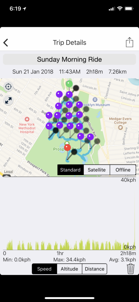
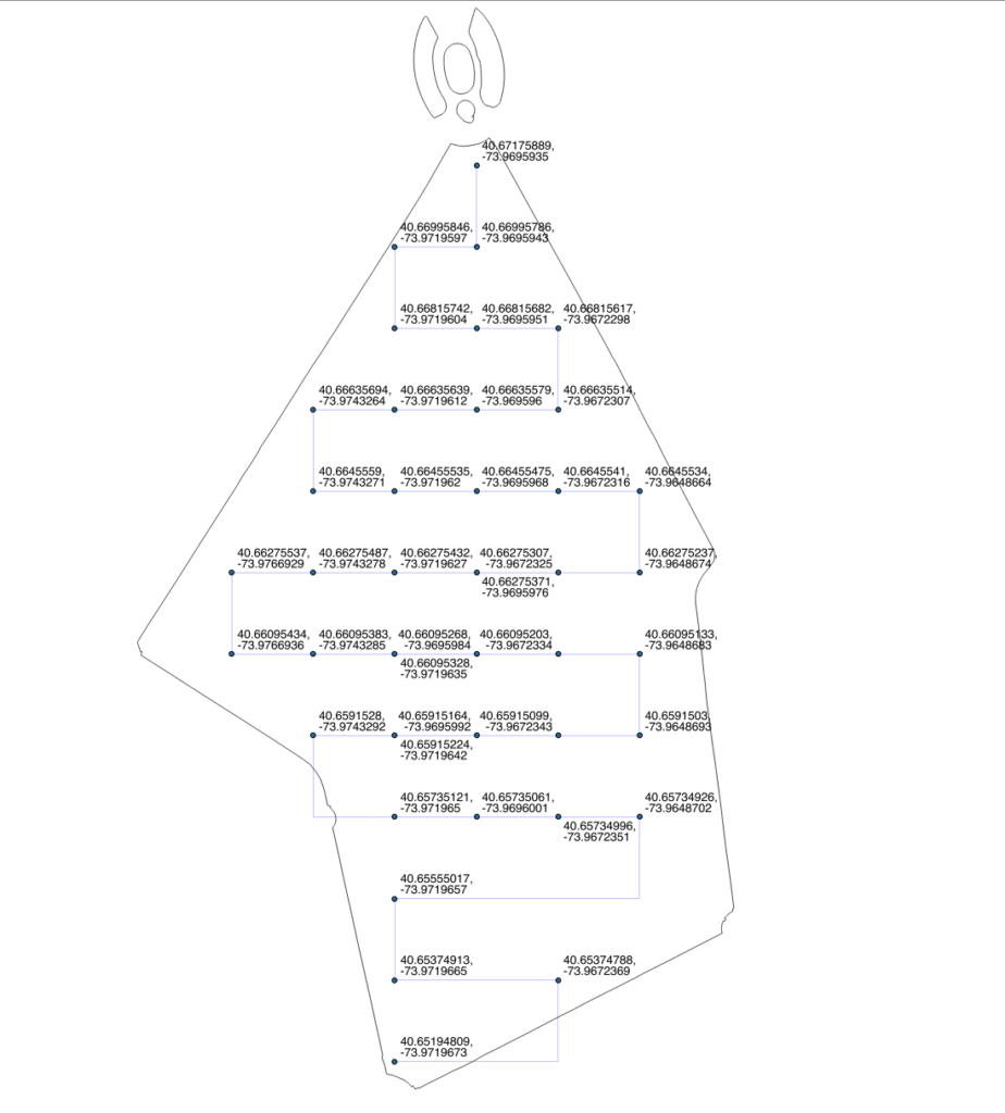
We overlaid a 200 meter grid on Prospect Park, ignoring features and topographic variation. Each point was identified by its latitude and longitude and an idealized snaking path that connected them. Our intention was walk to each point, collect data along the way, and capture additional data at each point.

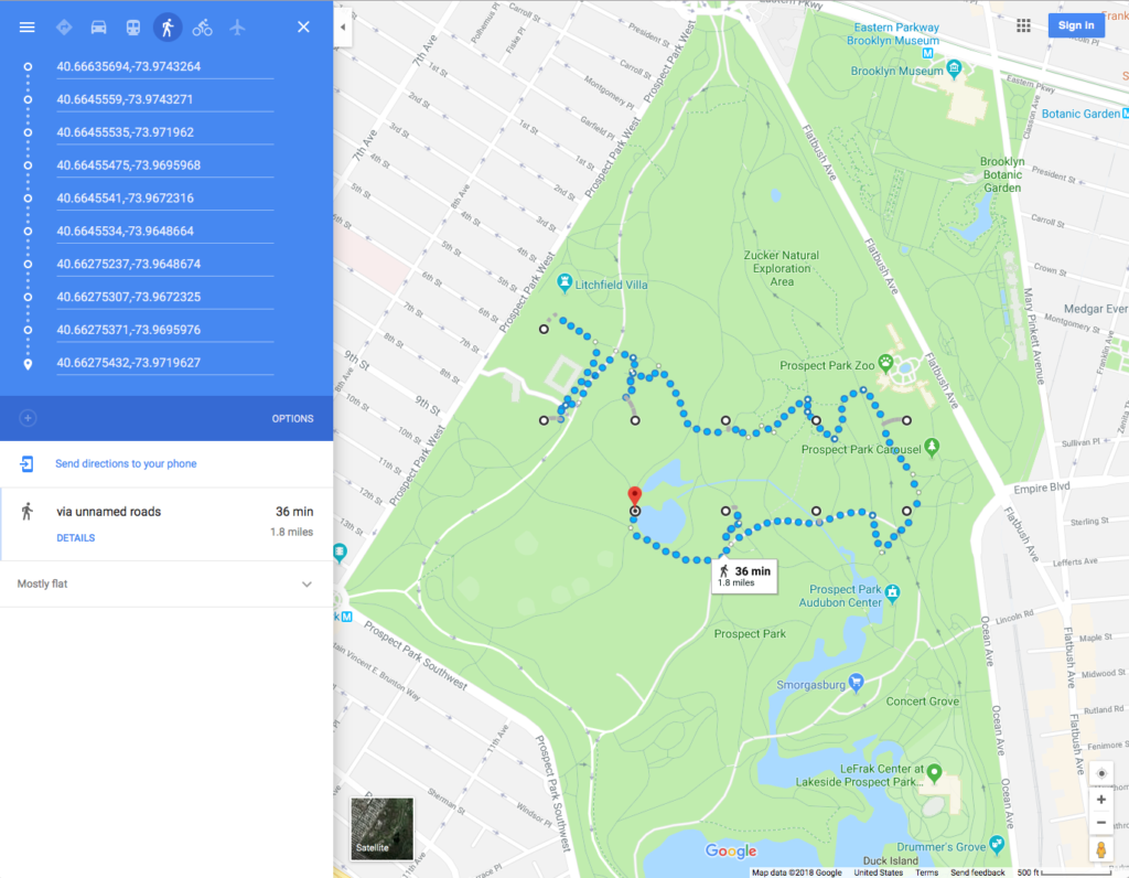
Prior to starting the walk, directions were generated using Google Maps between sets of 8 points to get a sense of time and distance. Google Maps was used as it has more specific path data than alternative platforms such as Apple Maps.

Once walking, these directions were abandoned in favor of entering each coordinate pair individually, point-by point. Occasionally, this method suffered from human error — entering the wrong point — evident by a deviation in the recorded path.

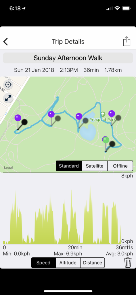
While walking, GPS position, accuracy, and altitude were captured using a Bad Elf GPS Logger. The track was automatically recorded at 12 second intervals, and when an intended grid point was reached, the position was marked as a point-of-interest. Additionally, three photos were taken of the GPS logger and two screenshots of its corresponding phone app to provide back up data. A photo of the sky, while facing north, was also taken at each point, to describe the conditions affecting the accuracy of the GPS positioning.

The impression was that data collection would be straightforward–we had coordinates on a grid and directions to each point. Using Apple and Google Maps, we assumed that if we entered exact coordinates, we would be routed to exact coordinates. As it turned out, mapping services are based on approximations. You don’t arrive at your destination so much as you arrive in its general proximity, with the presumption that you’ll be able to find your way from there. This illustrates the scale in which these services operate — three to five meters — and a remnant of human cognition left in the navigation process. These services foster an illusion of getting you where you need to go, but they only take you part of the way, and only on paths known to the services.