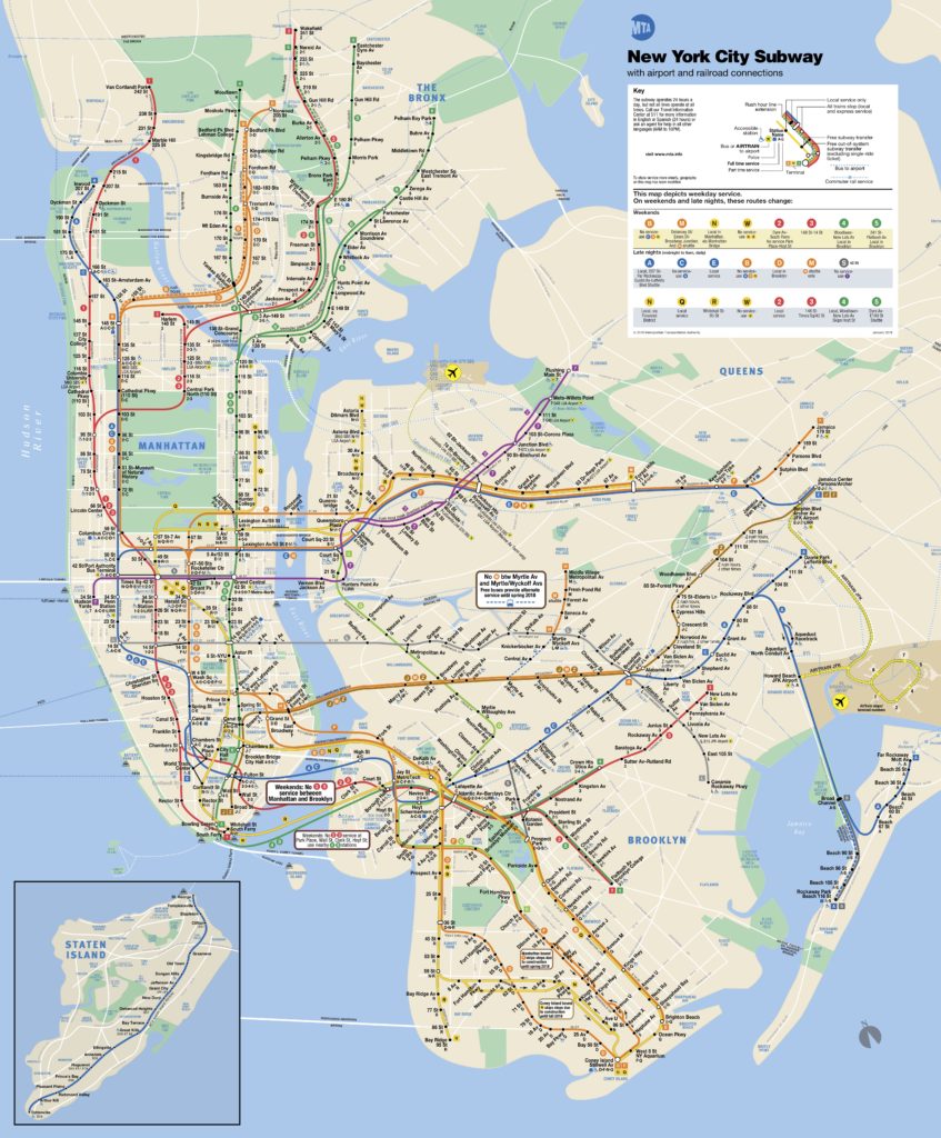
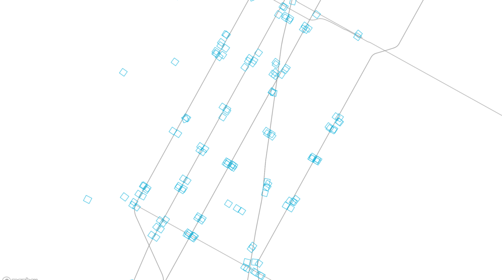
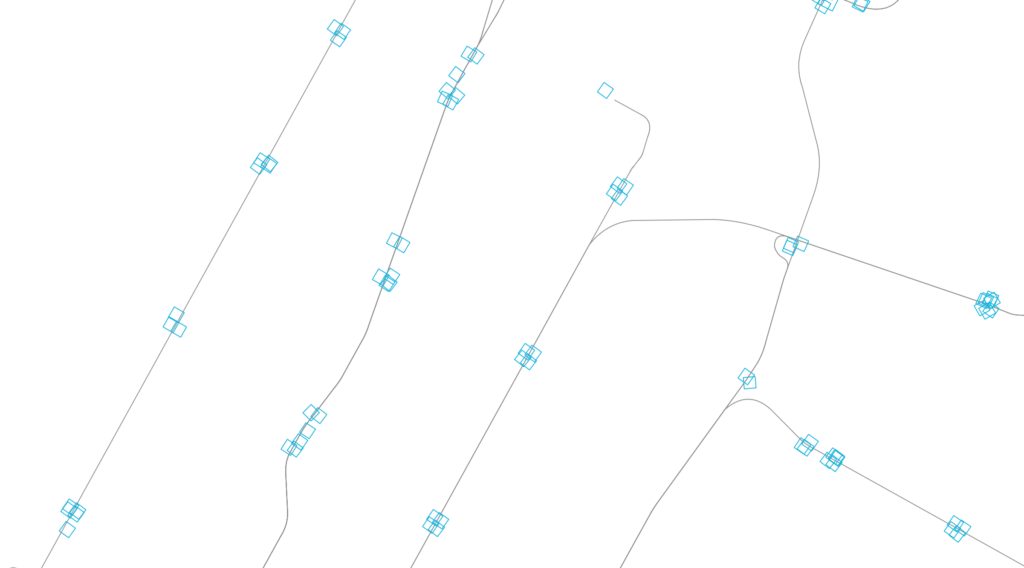
“Subway at Grade” (live link) plots all subway entrances within New York City. Departing from a previous exploration — From City Island (006) — the map explores transit density and sparseness at the scale of the subway entrance. Why do some stations have many entrances and some only a few? How far are the entrances from the subway platforms? Were entrances always inside of buildings or did the buildings build over entrances?
By emphasizing scale over clarity, as in the standard MTA subway map, the irregularity and idiosyncracies of the system become more evident.

When an entrance is clicked, the map zooms to the location and shows the corresponding aerial. After a few seconds, the map zooms back out and the aerial fades.
The map is displayed with Mapbox GL, and Turf.js was used to manipulate data. The footprints of the subway entrances themselves are very small, so an offset around each was created. First, a radial buffer was determined around each centerpoint, around which a bounding box generated a square extent. The square was rotated to match the orientation of the entrance. The angle of rotation was calculated using Math.atan() on the slope of one edge. Rather than dynamically create these offsets on the client-side, they were saved as a GEOJSON feature collection and loaded with the other GIS data.
The aerial mask was achieved by differencing the clicked station object with the overall map extent, and overlaying a solid white fill.
Next steps:
- Add outline of subway station footprint below grade, if such data exists
- Adjust colors of subway entrances to correspond to their line
- Add labels for each station on click
- Show nearby aerials also when zooming to particular stations
- Add a mode to show aerials above each entrance in a grid, grouped by station. This removes the geographic space between them to give new adjacency and meaning.
- Options to try:
- On click, zoom in to a slightly larger image (but more cropped than currently), which reorients to ortho and shows other images of the entrances at the station (in a row) and the other stations (stacked rows) – maybe it slowly auto scrolls? Four or five rows visible?
- Only show route lines on click (connect the stops on the particular line
- Sidebar with grid of images for each subway stop on line (one row per station)
- Export images of each subway station from QGIS? Or, can it be done by grabbing the images clientside from the canvas? (probably not good from a perf. standpoint)

